


SAii Hotels & Resorts
Global Rebrand
The Project
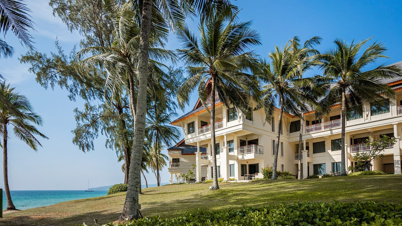
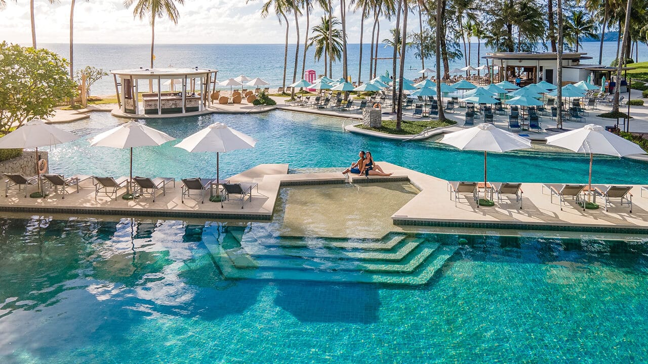
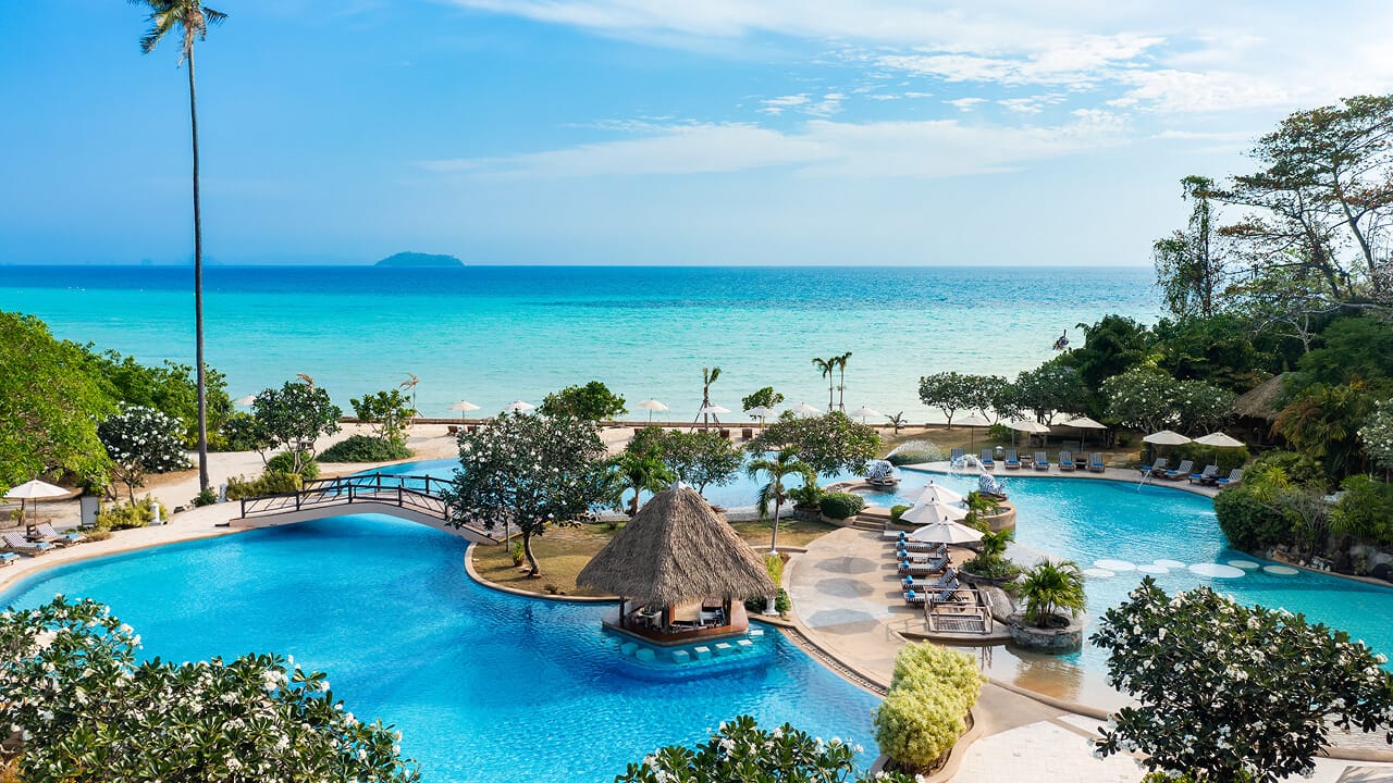
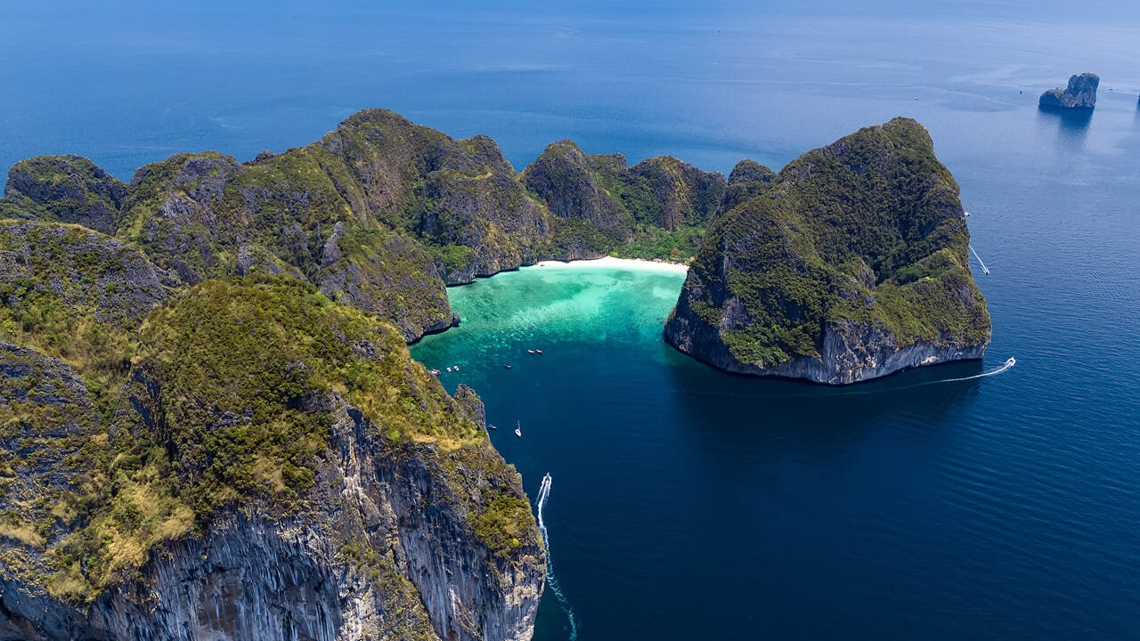
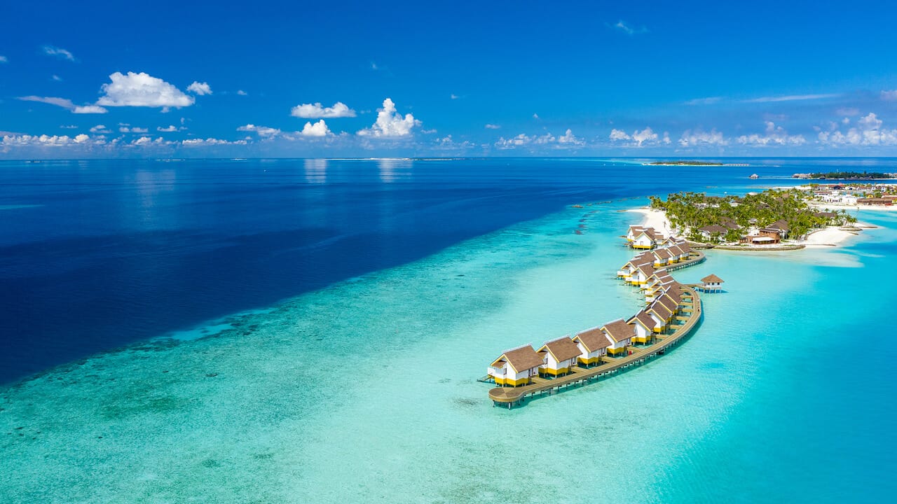
SAii Hotels & Resorts is a collection of beautifully curated escapes across Thailand and the Maldives, part of the dynamic S Hotels & Resorts portfolio - the hospitaility arm of the Singha Estate. It quickly became clear that the existing brand wasn't robust or distinctive enough to carry that growth.
After an immersive on-the-ground field trip, our challenge was to ready SAii for expansion, shaping a clear, future-fit brand architecture, defining a distinctive tone of voice, and creating a visual identity system that could flex across regions and cultures.
Roles
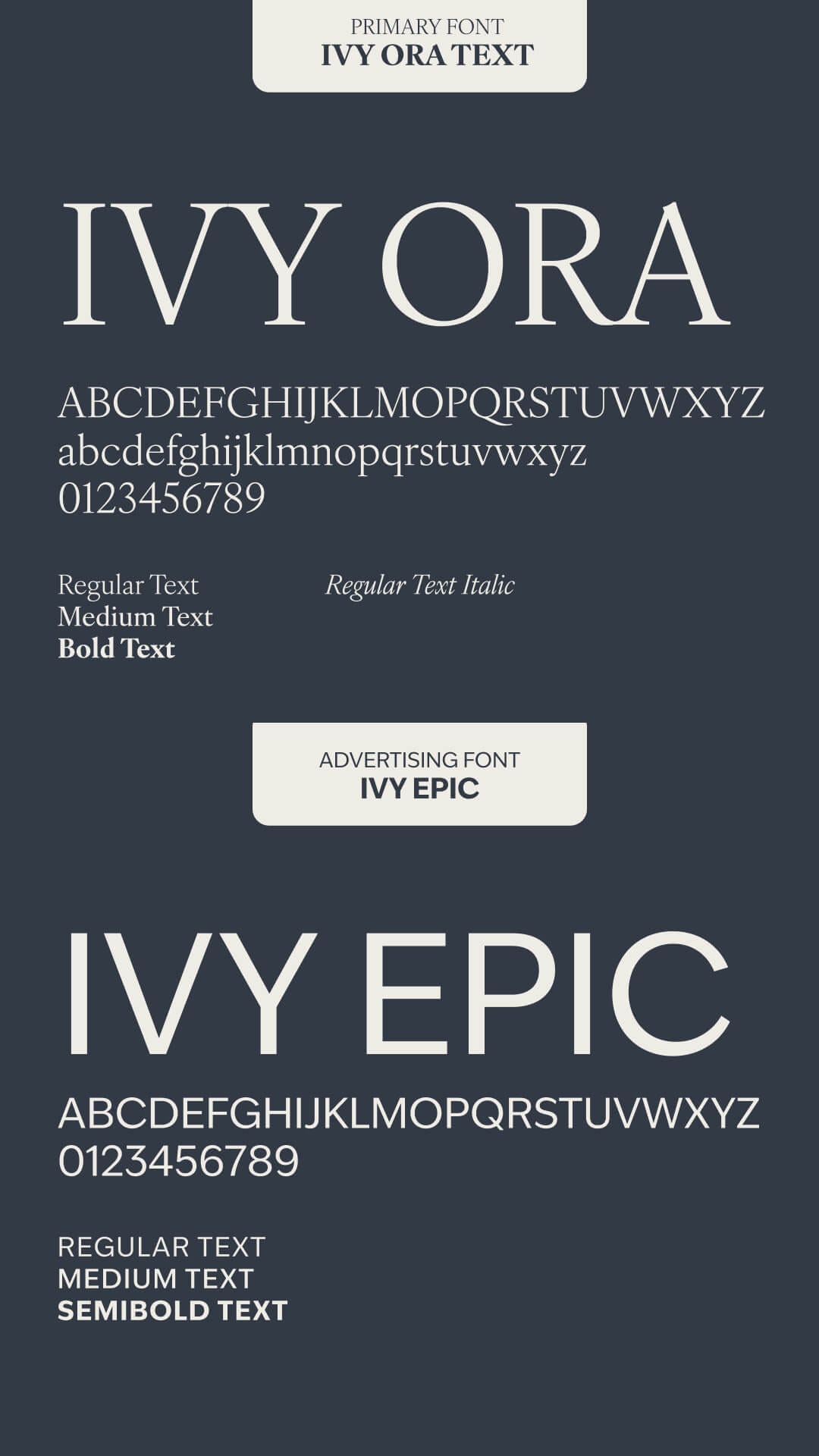
Brand Strategy, Visual Identity, Messaging, Digital Delivery
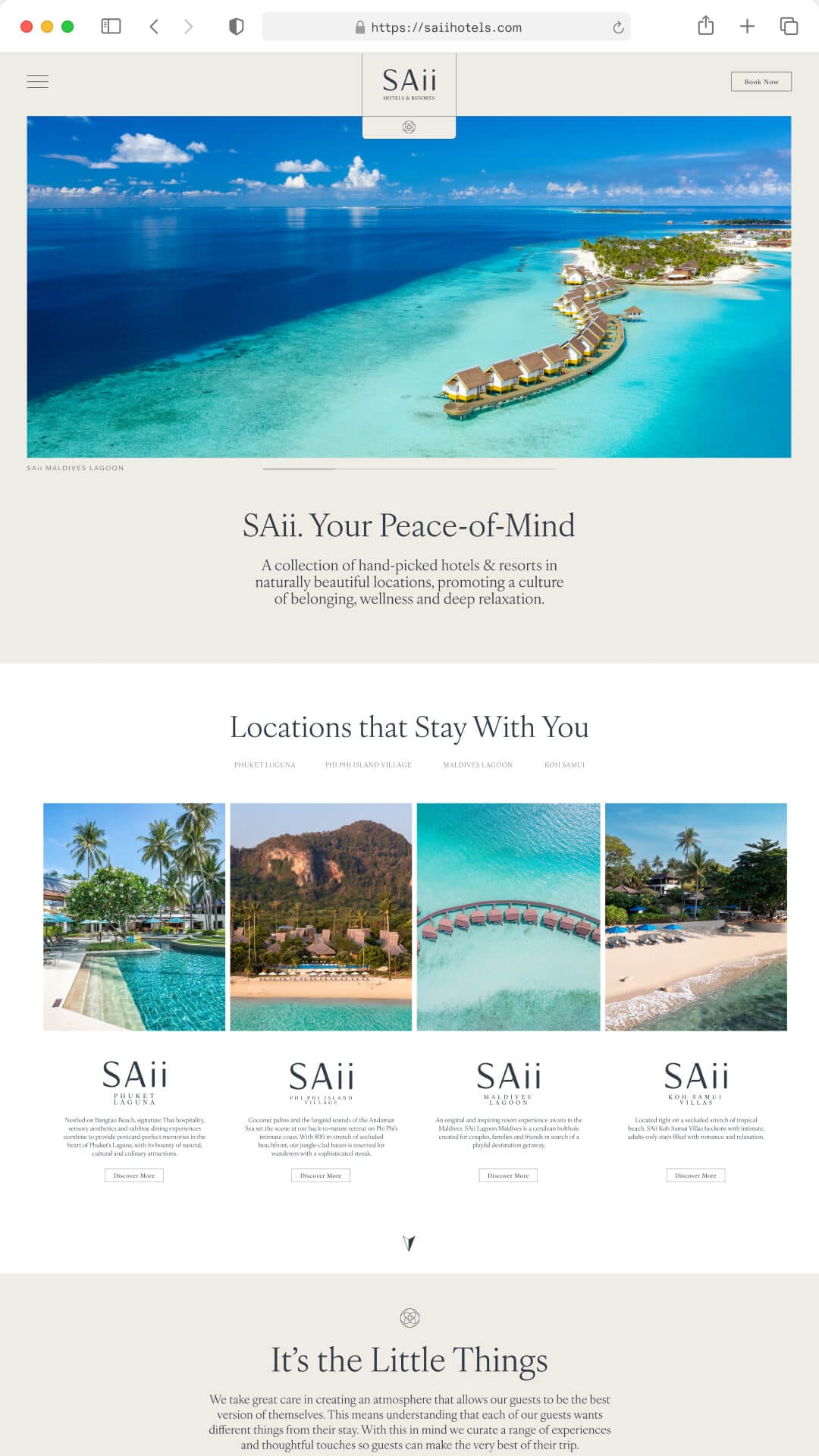
The SAii Brand
Strategy
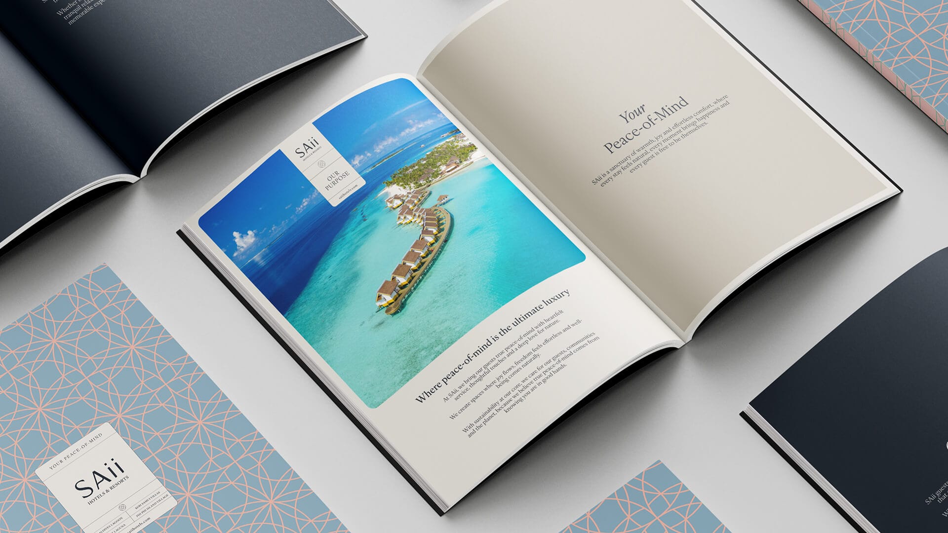
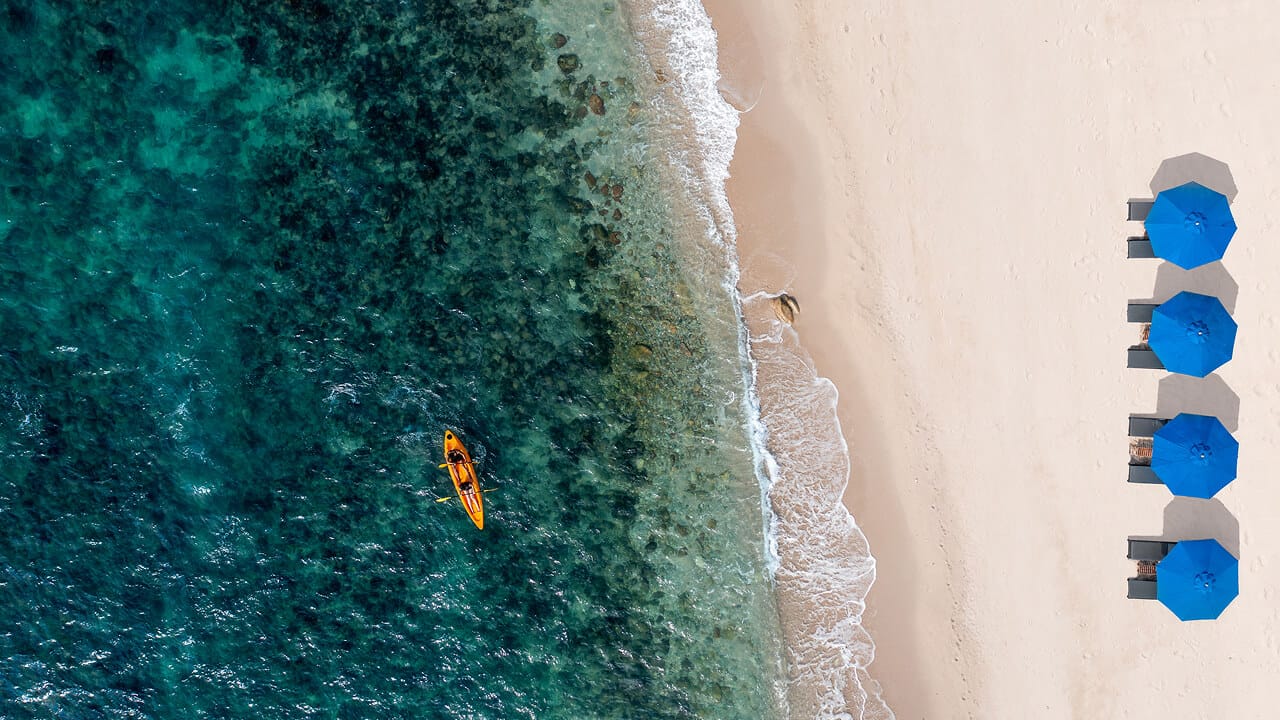
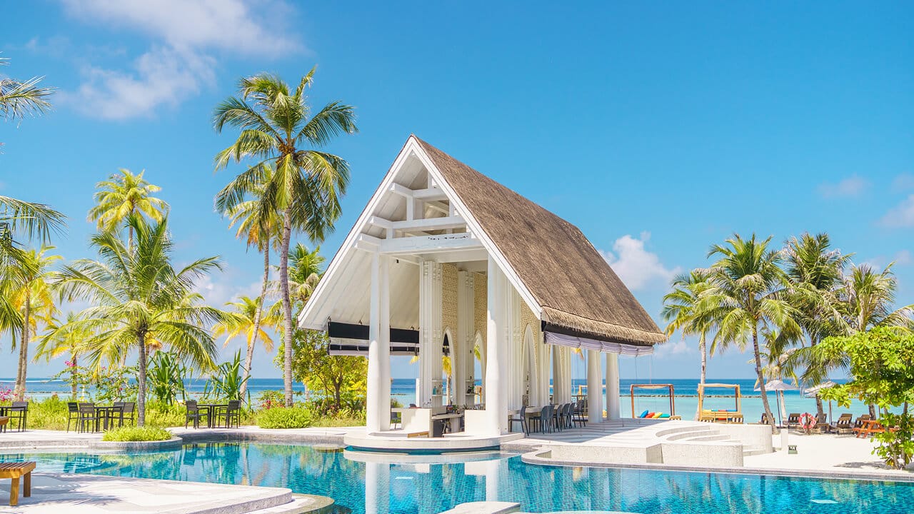
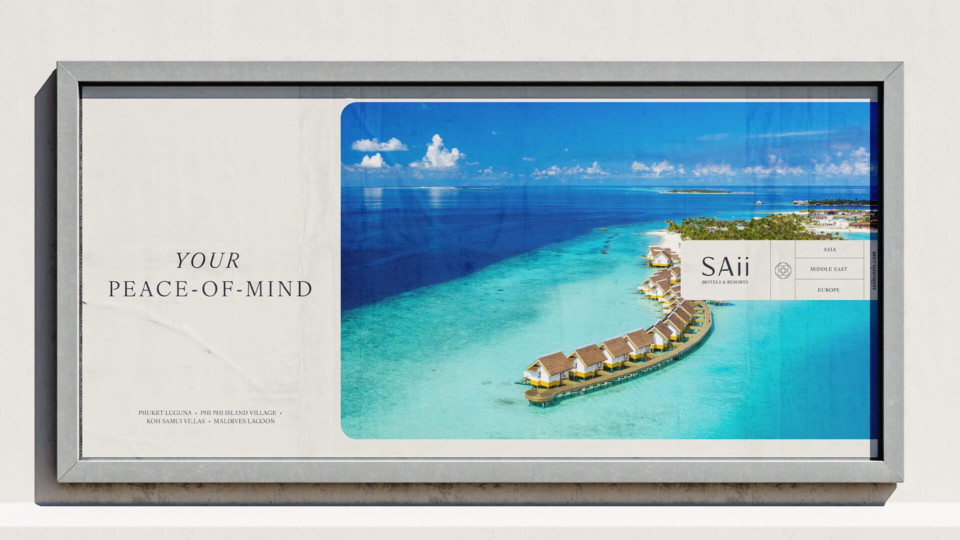
Lovingly crafted for the modern traveller, SAii Hotels & Resorts knows that true peace of mind is the ultimate luxury. It’s the freedom for guests to be themselves, without expectation. The reassurance that caring for local communities, the environment, guest well-being, and sustainably sourced produce is simply how SAii does things. Of course, the promise that luxurious comfort and outstanding locations are a given.

This concept of 'where peace-of-mind is the ultimate luxury' became the foundation of our brand strategy a clear, authentic promise that threads through SAii's tone of voice, service culture, and guest experience. It's this guiding principle that shaped our comprehensive visual redesign, ensuring every touchpoint feels as uplifting and genuine as the stays themselves.
Visual Identity
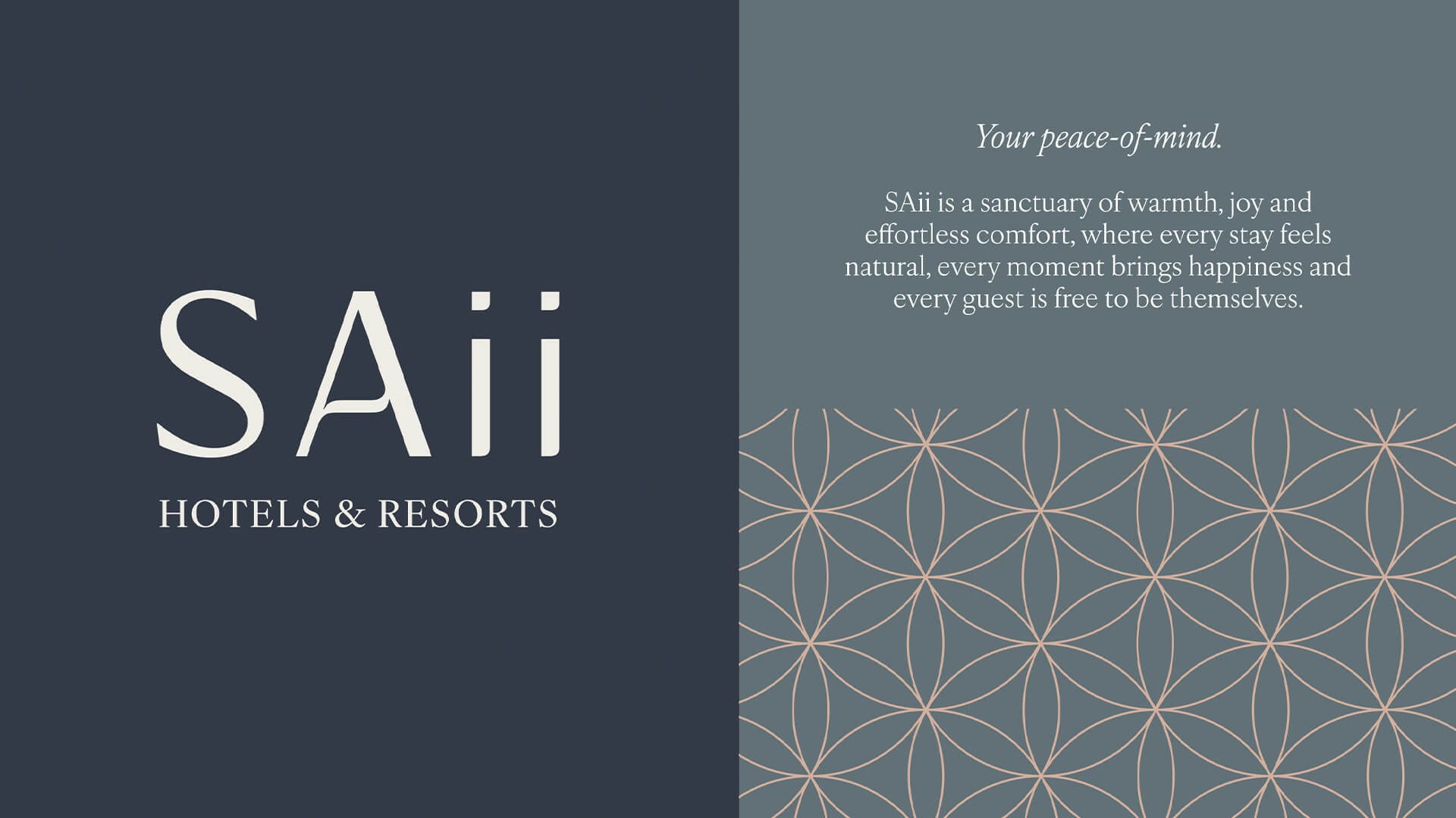
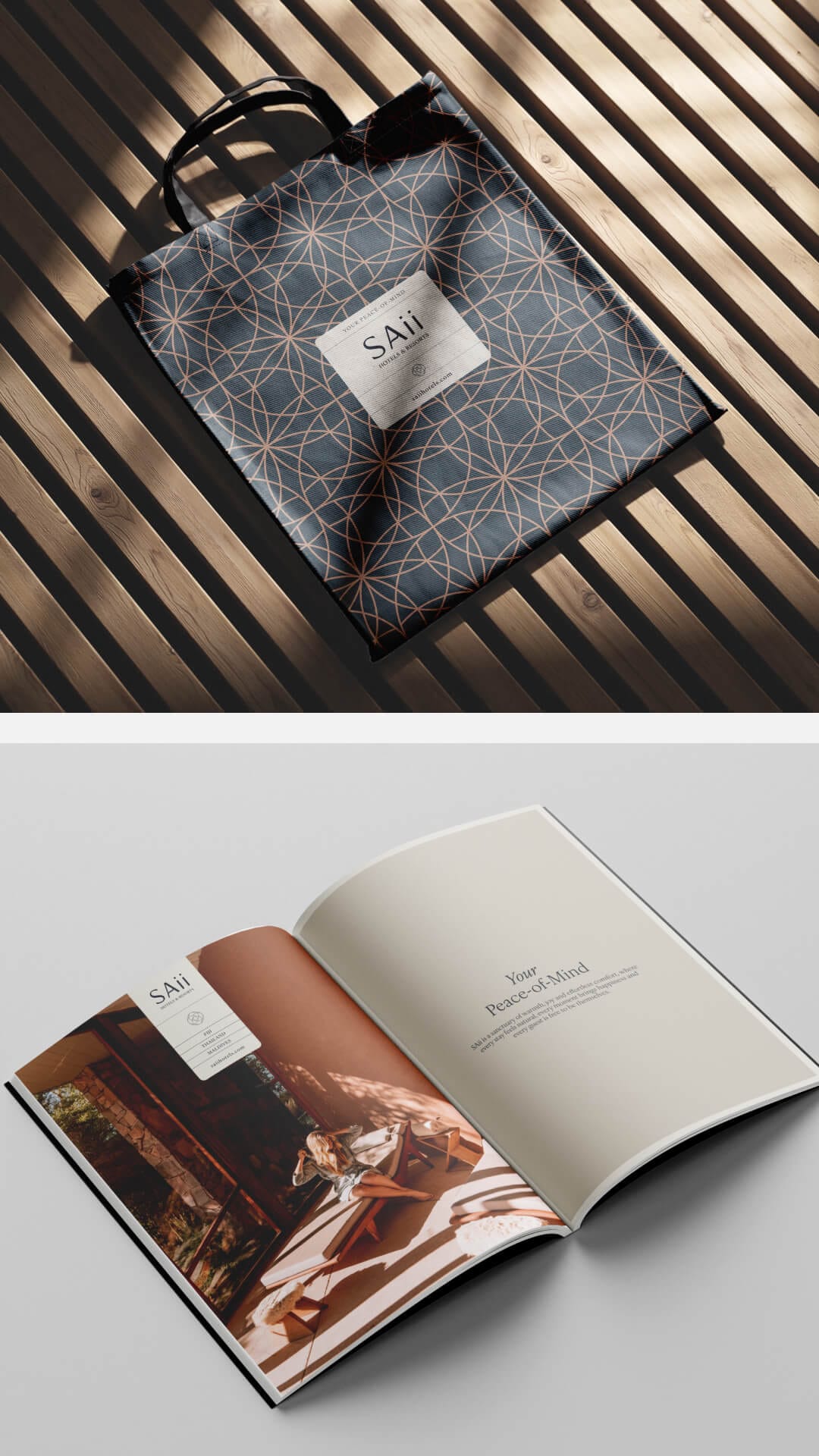
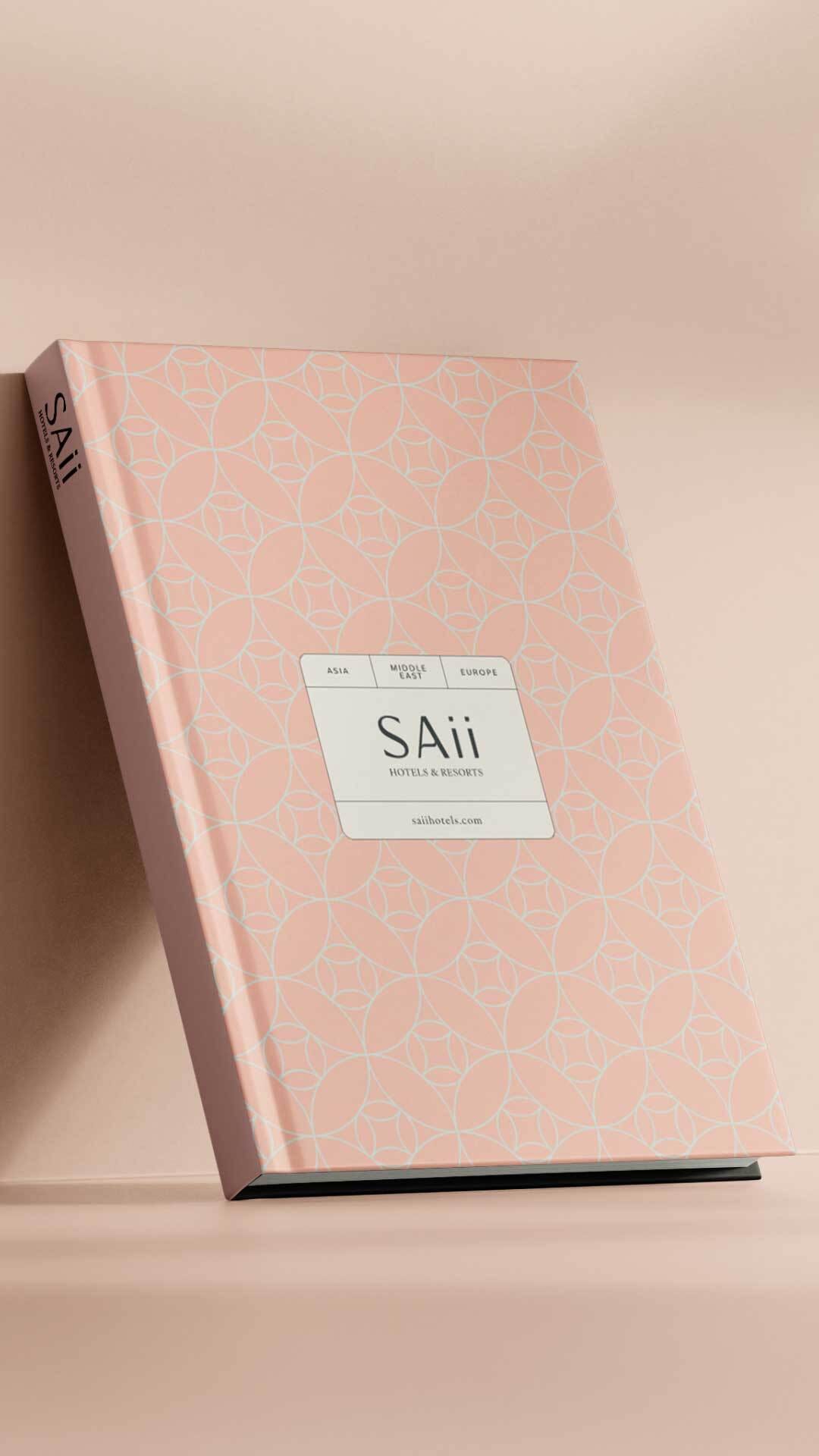
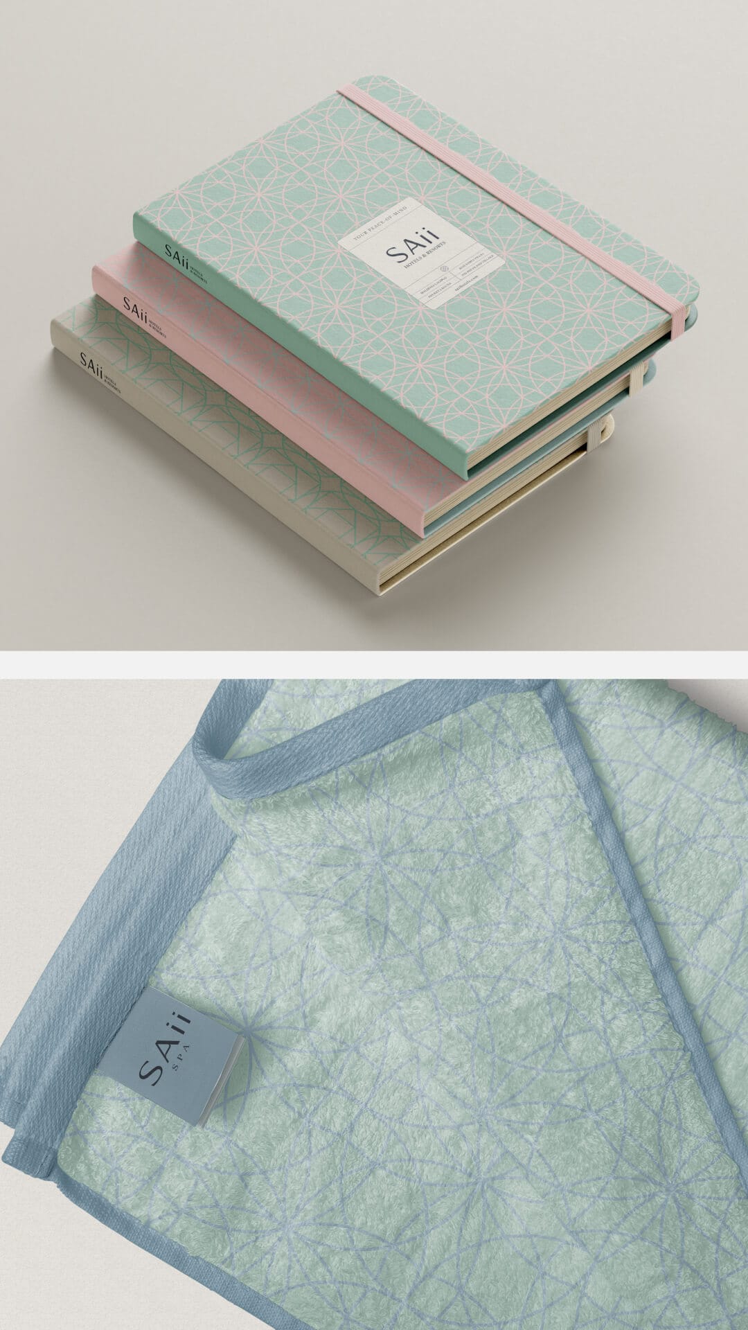
The refreshed SAii logo breathes new life into the brand while honouring what guests already know and love. Subtle tweaks were made to marry the mark more closely with the overarching brand strategy bringing a softer, more inviting feel.
This update, along with the wider visual system, ensures that every element works together to express SAii's unique blend of laid-back luxury, care for nature, and heartfelt service. It's an identity designed to grow with the brand, wherever it goes next.
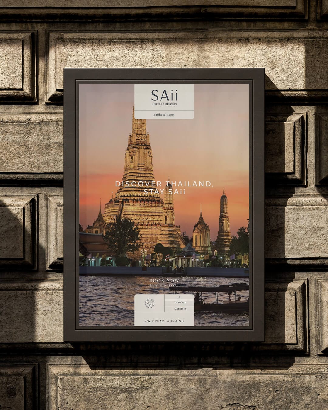
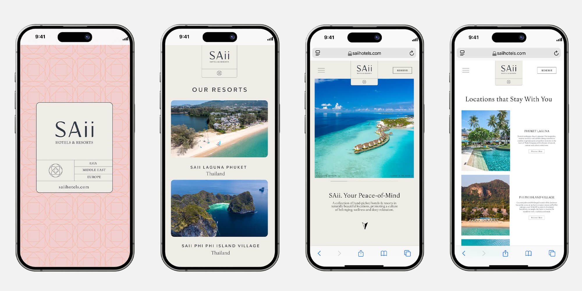
Design System
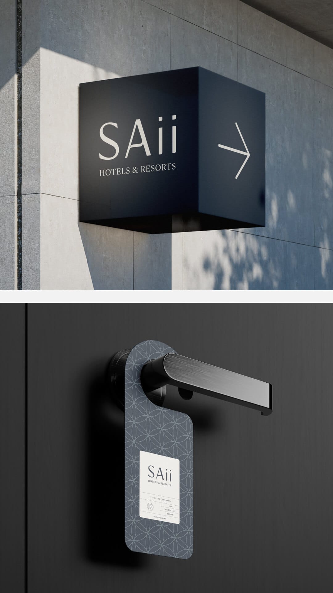
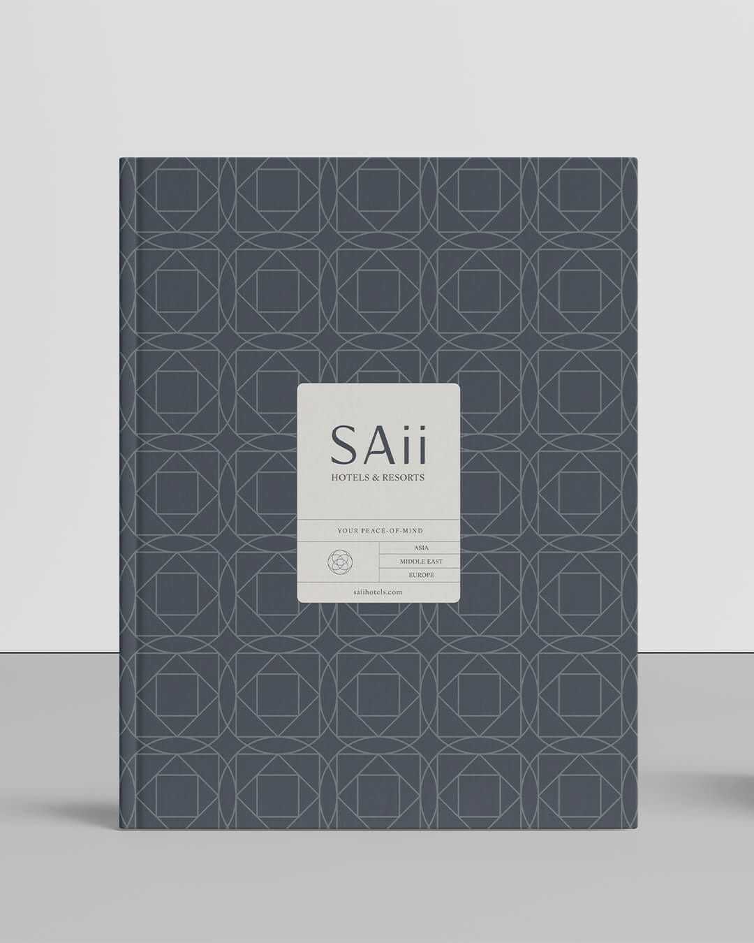
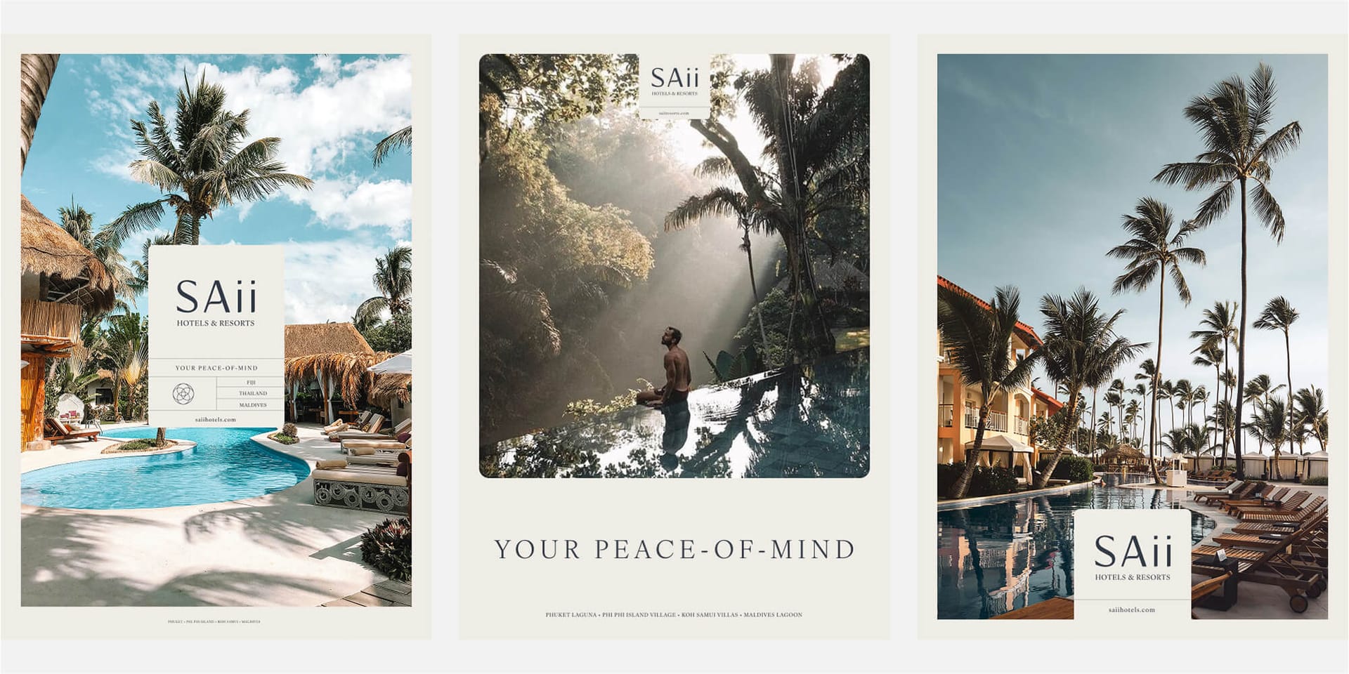
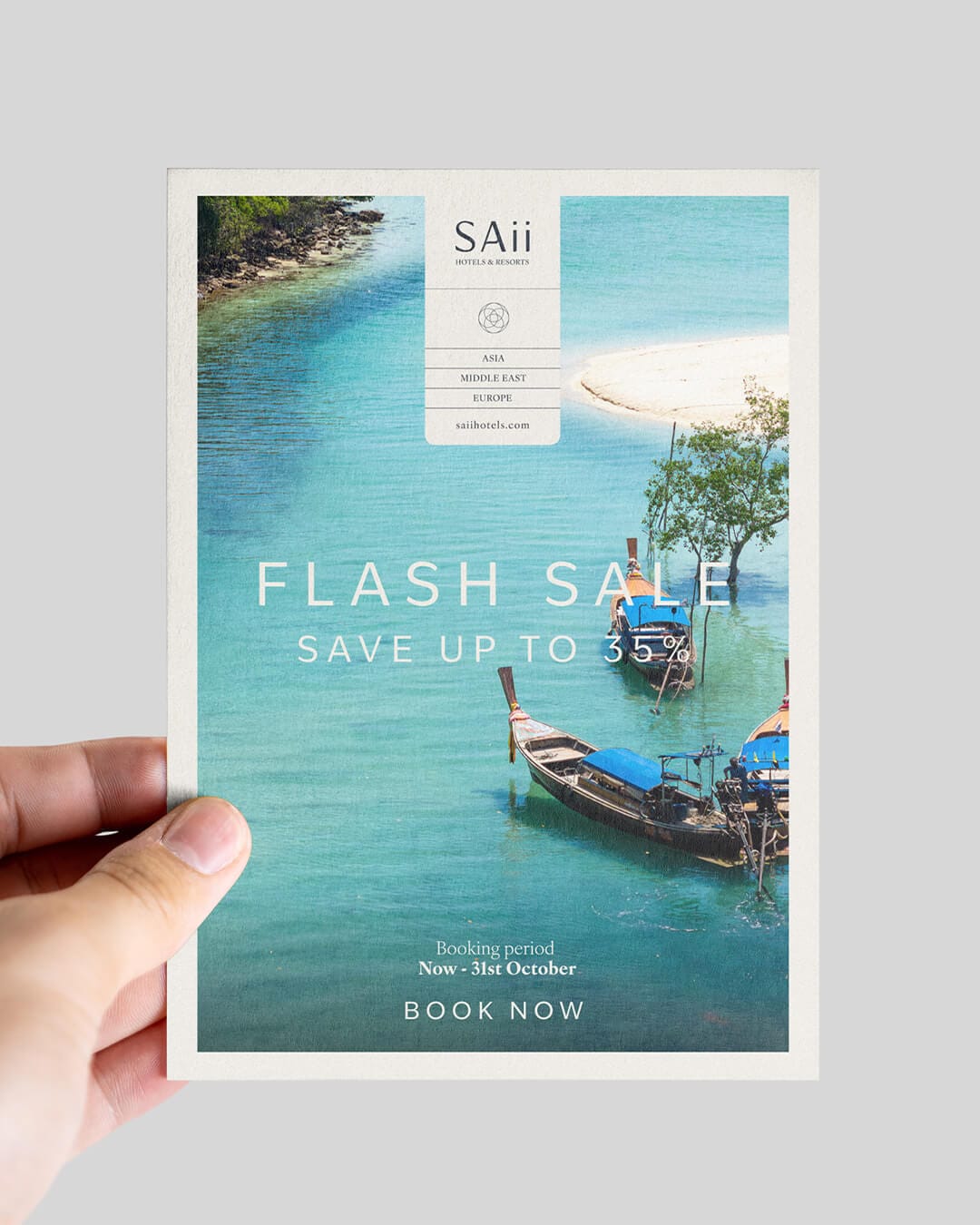
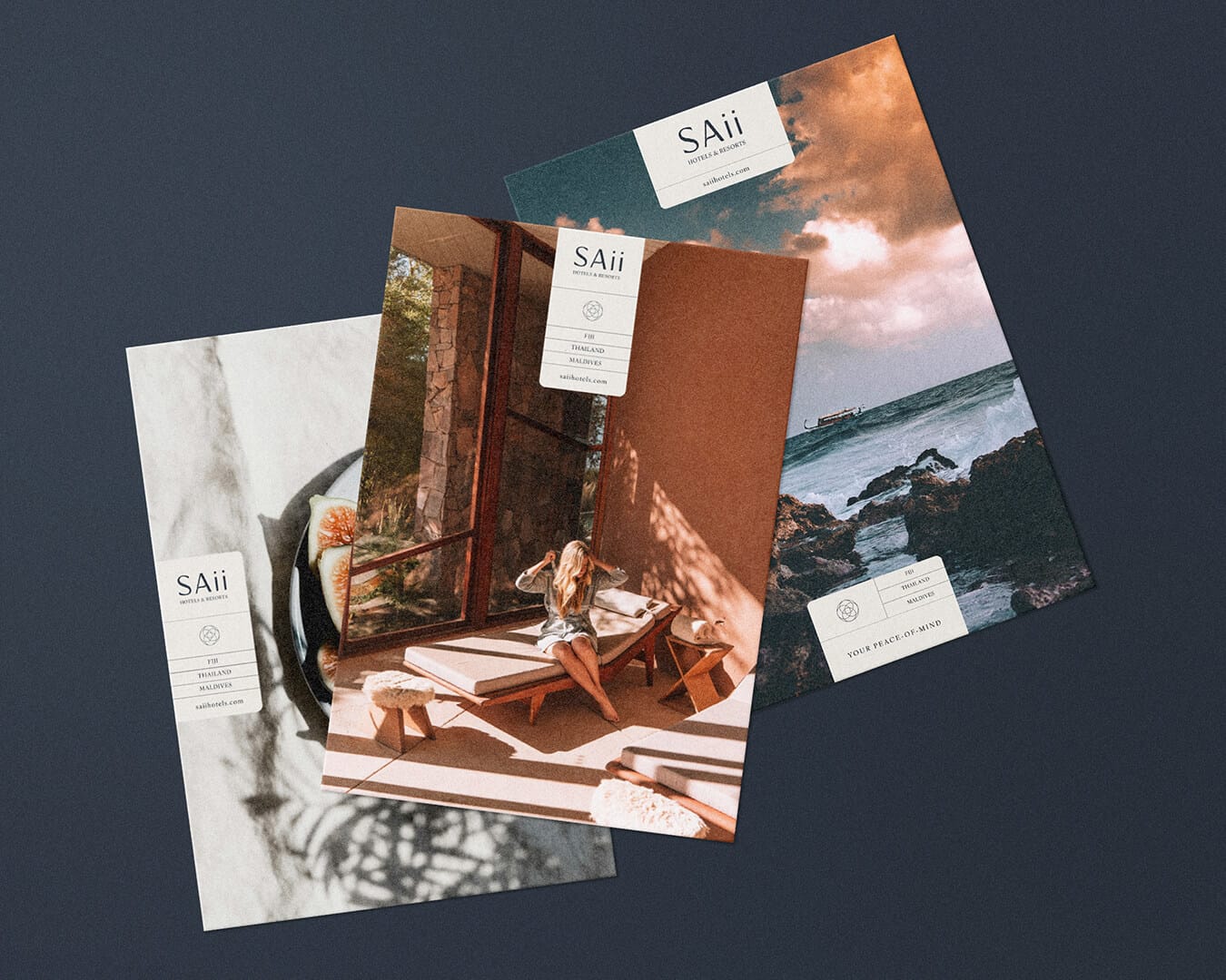
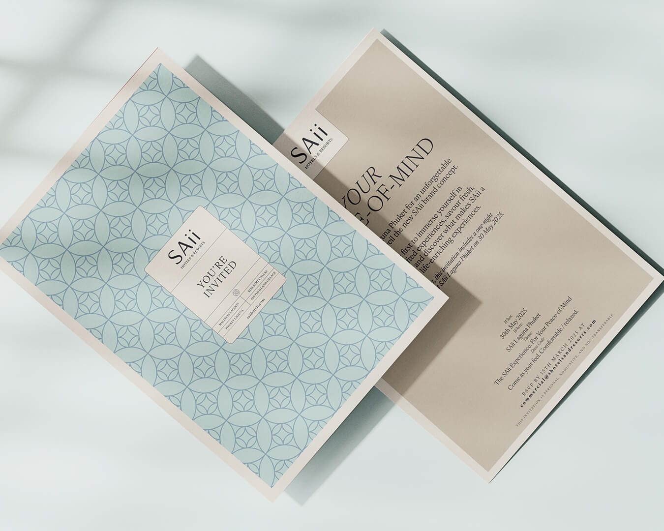
We crafted the SAii design system as a simple yet distinctive tab device that neatly organises key identity elements.
Each 'tab' neatly locks up the logo, tagline, and adaptable details such as destination clusters, regions, or the core web address. This ensures that no matter where SAii is displayed, whether promoting a single resort, multiple locations, or whole continents the brand always feels unified and easy to recognise.
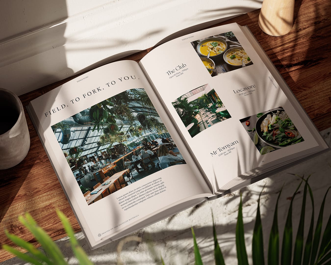
The system also cleverly supports photography, giving images room to breathe while making sure the essential identity elements remain legible and balanced.
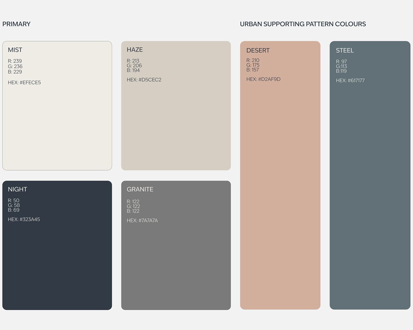
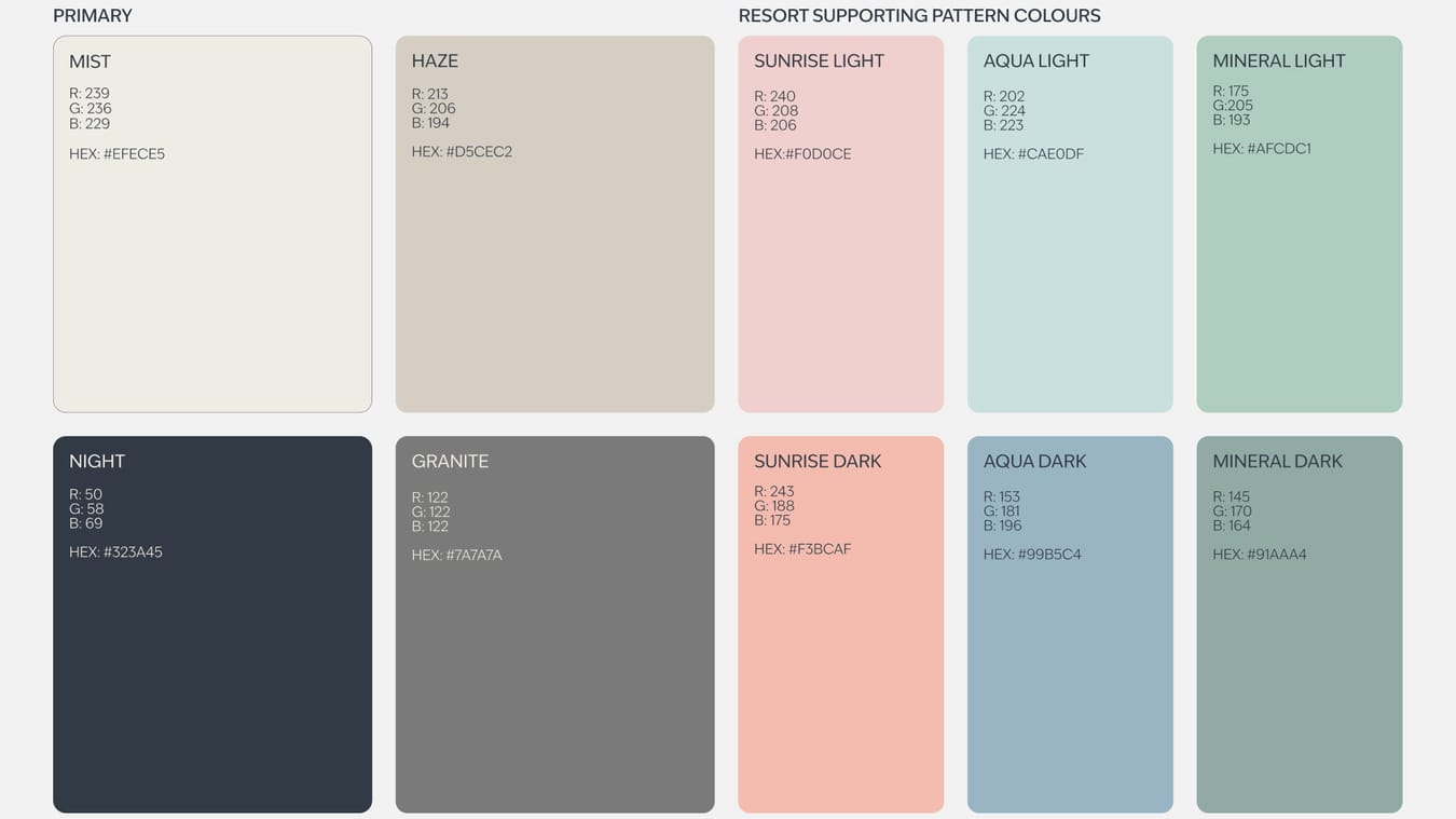
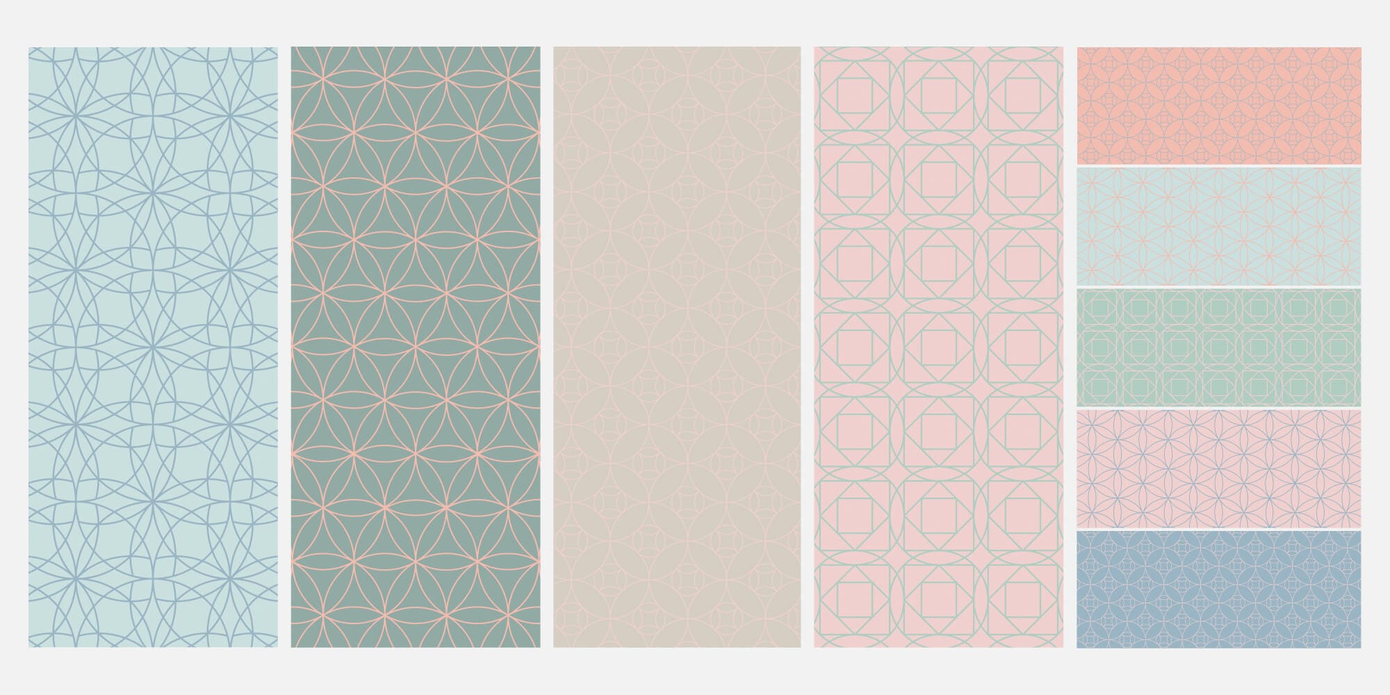
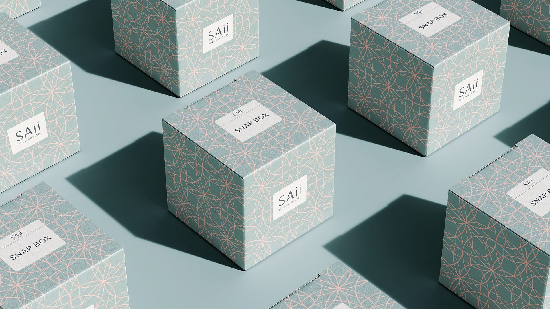
SAii's colour palette is a calming blend of soft, nature-inspired pastels and grounding neutrals. Gentle shades create a sense of lightness and ease, while deeper tones bring balance and sophistication.Each colour complements the next, working together to evoke a sense of peace, comfort, and understated luxury.
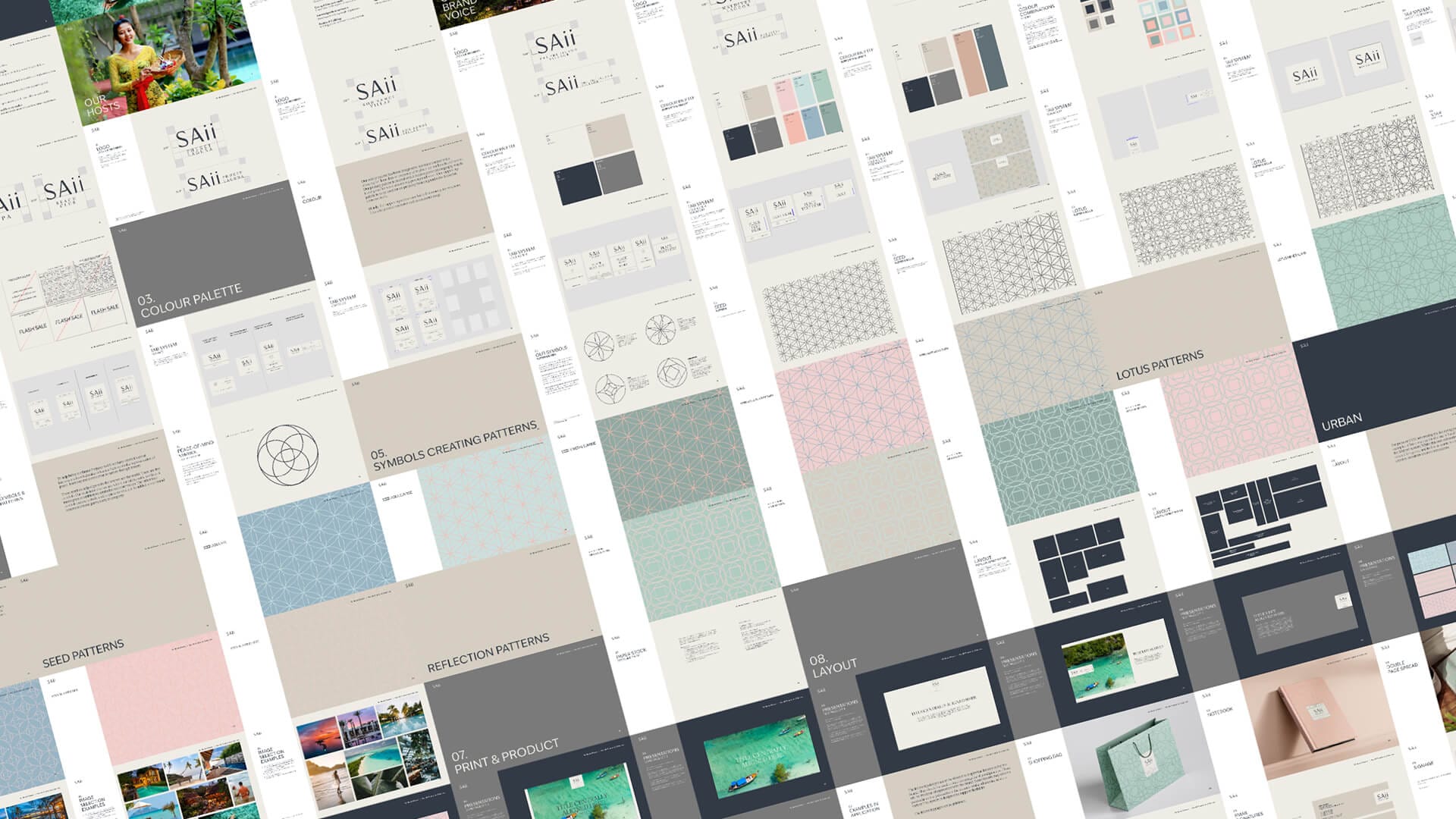
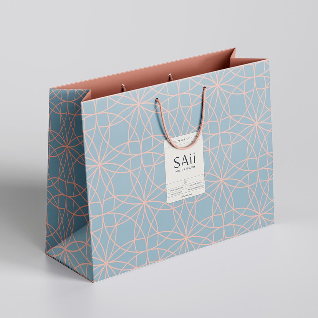
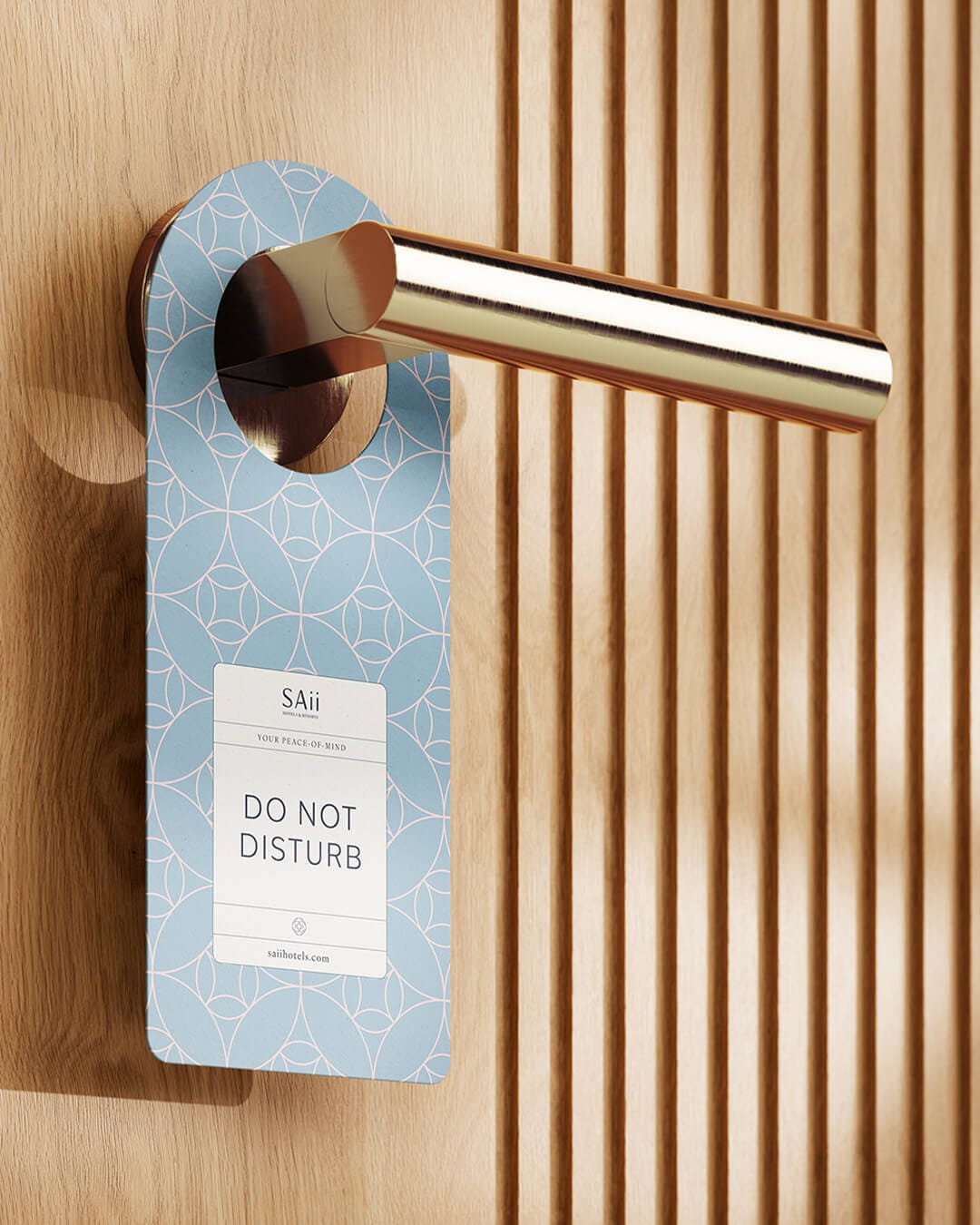
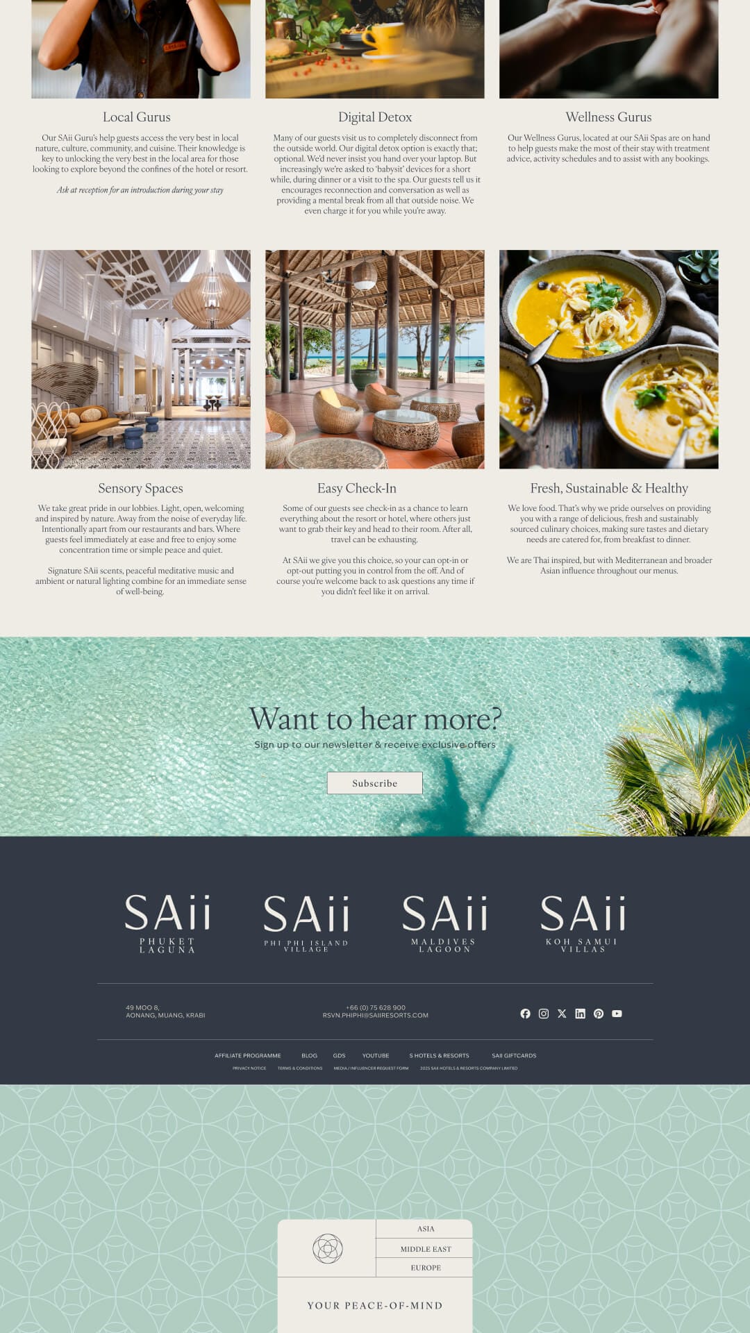
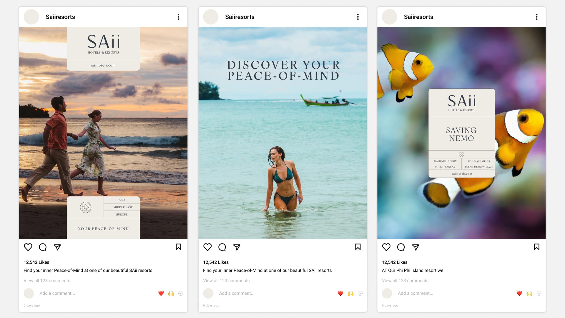
Symbols & Patterns
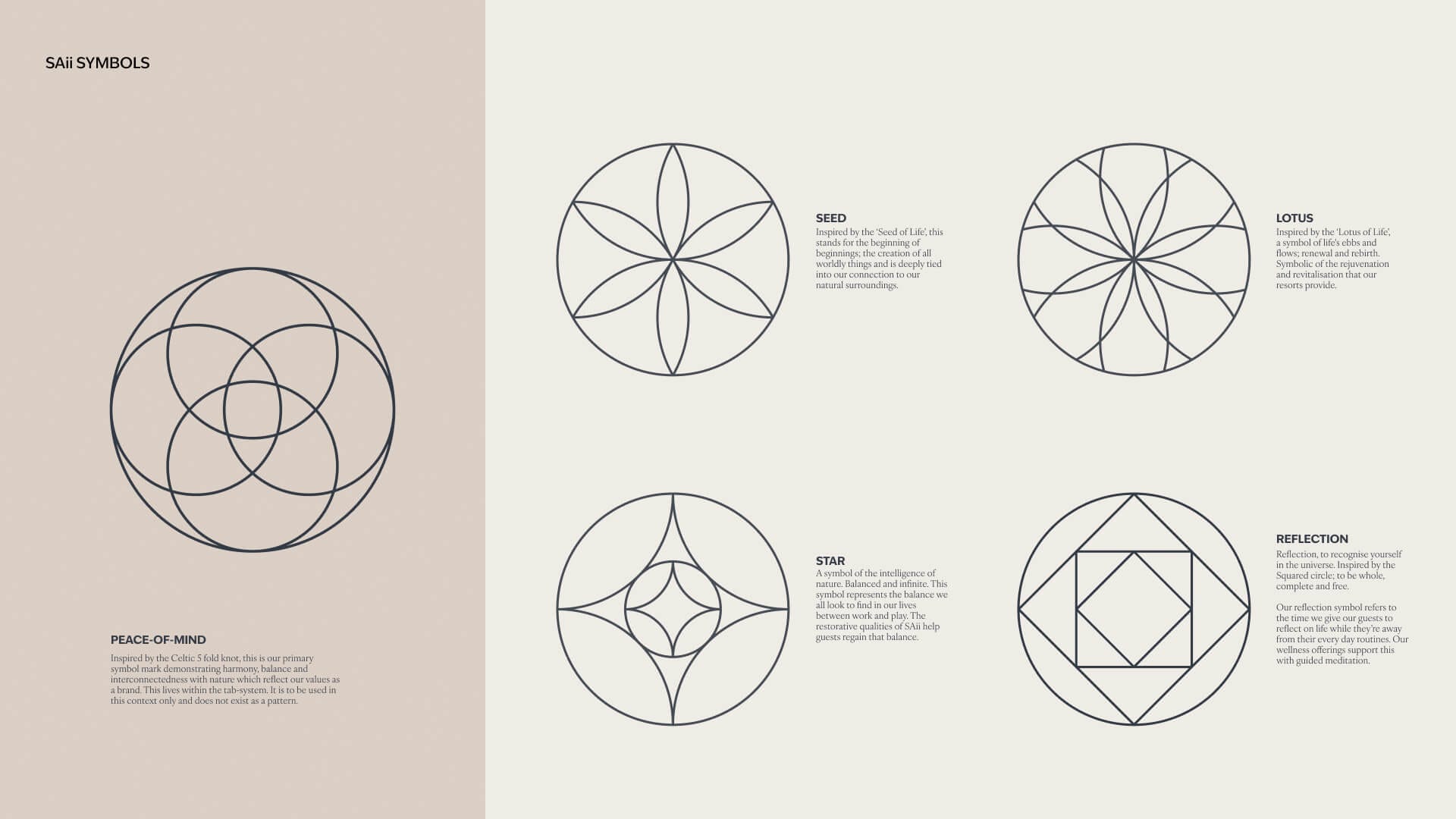
To help bring SAi's brand purpose to life, we created a bespoke set of symbols inspired by timeless representations of peace, harmony, and a deep connection to nature. These marks reflect the way SAii sees the world thoughtful, balanced, and rooted in care.
At the centre is our main icon, used within the tab system as a distinctive monogram or emblem that captures our core values. Surrounding it are four supporting symbols, designed as subtle patterns that add texture and meaning to brand communications, especially throughout each property, creating little moments of discovery for guests.
Digital
We ensured the new brand system was ready for the digital world too, giving clear design intent and flexible guidelines for all digital applications, from the website to in-room apps. Every touchpoint was crafted to feel breathable, calm, and intuitive.
Scaling the brand
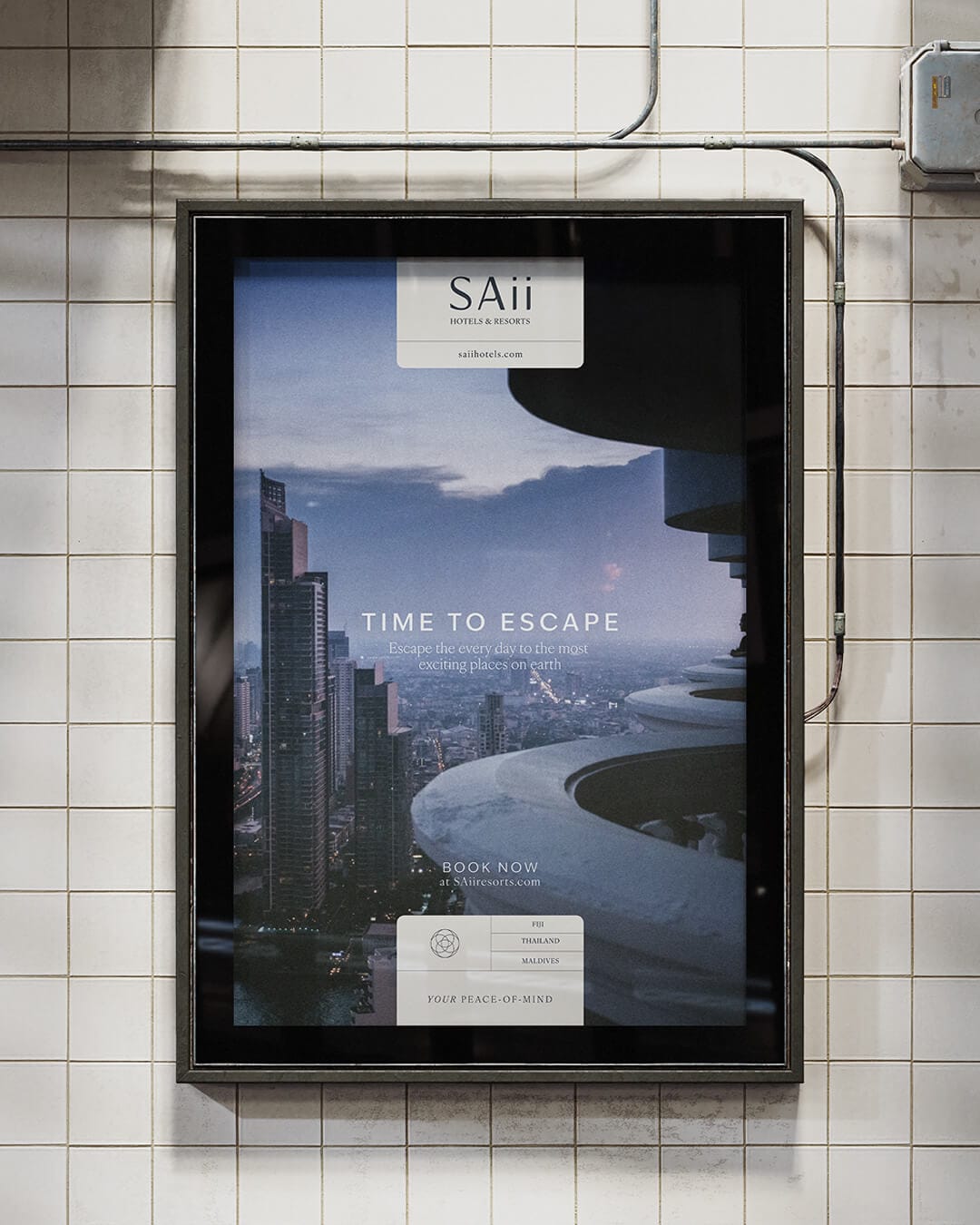
As SAii looks beyond its stunning beach resorts to vibrant inner-city destinations, it was important that the brand could evolve across different environments. From lush islands and tranquil lagoons to buzzing urban hubs, every SAii location still needs to feel part of the same family, delivering that same sense of peace-of-mind wherever guests choose to stay.
We achieved this with a refreshed urban colour palette makes that possible. Calming neutrals still capture the laid-back resort spirit, while deeper, moodier tones add a contemporary edge for city settings. This balance means the brand feels just as at home in a beachfront villa as it does in a chic city hotel. Ready to scale globally without ever losing its soul.