


Brand Creation
Rovello Coffee Soda
The Project
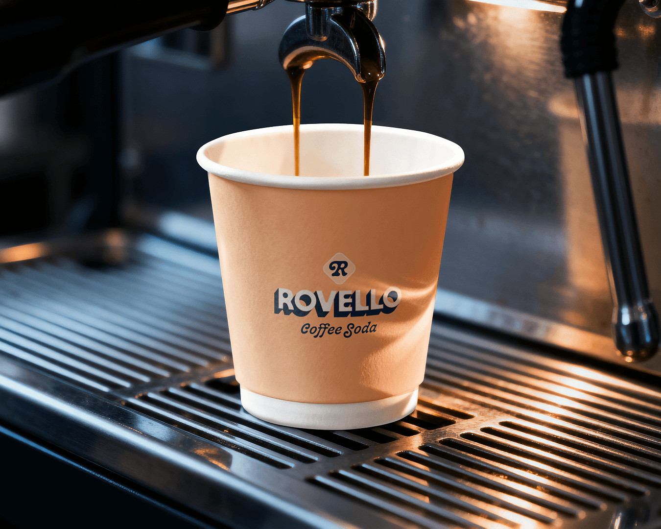
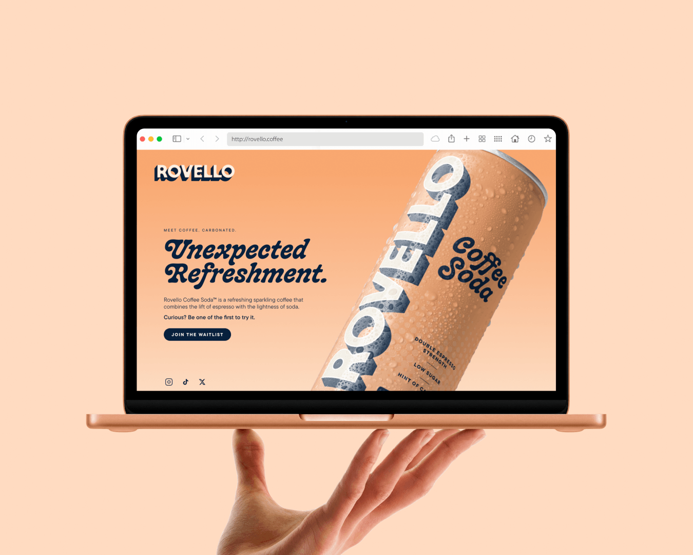
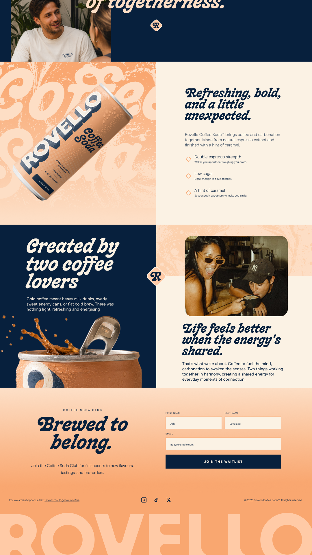
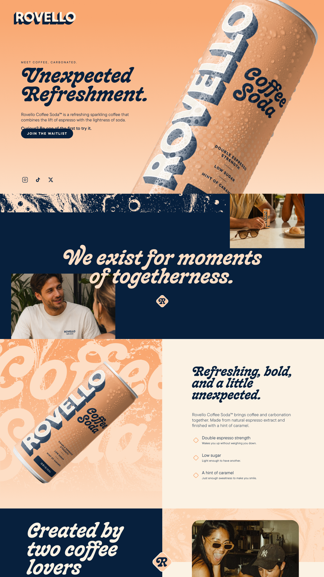
Rovello is a new coffee soda created for sharing. We developed the brand from the ground up, from the strategy and the name to the visual and verbal identity, packaging and website.
Roles
Nomenclature, Visual Identity, Product Packaging, Verbal Identity, Website
Brief
RTD coffee is a small corner of UK drinks, but a fast-growing one: around $520m in 2026, up about 6% a year. When the founders came to us with their coffee soda recipe, we saw more than a can to design. We saw a chance to own a new category, and whoever defines a category first usually gets to keep it.
The brief was to build a brand for a drink nobody had tried before, one that would make people curious enough to pick it up. That meant bringing two worlds together, coffee and carbonates, with a name and identity that were instantly memorable and felt like community from the first look.
Strategy
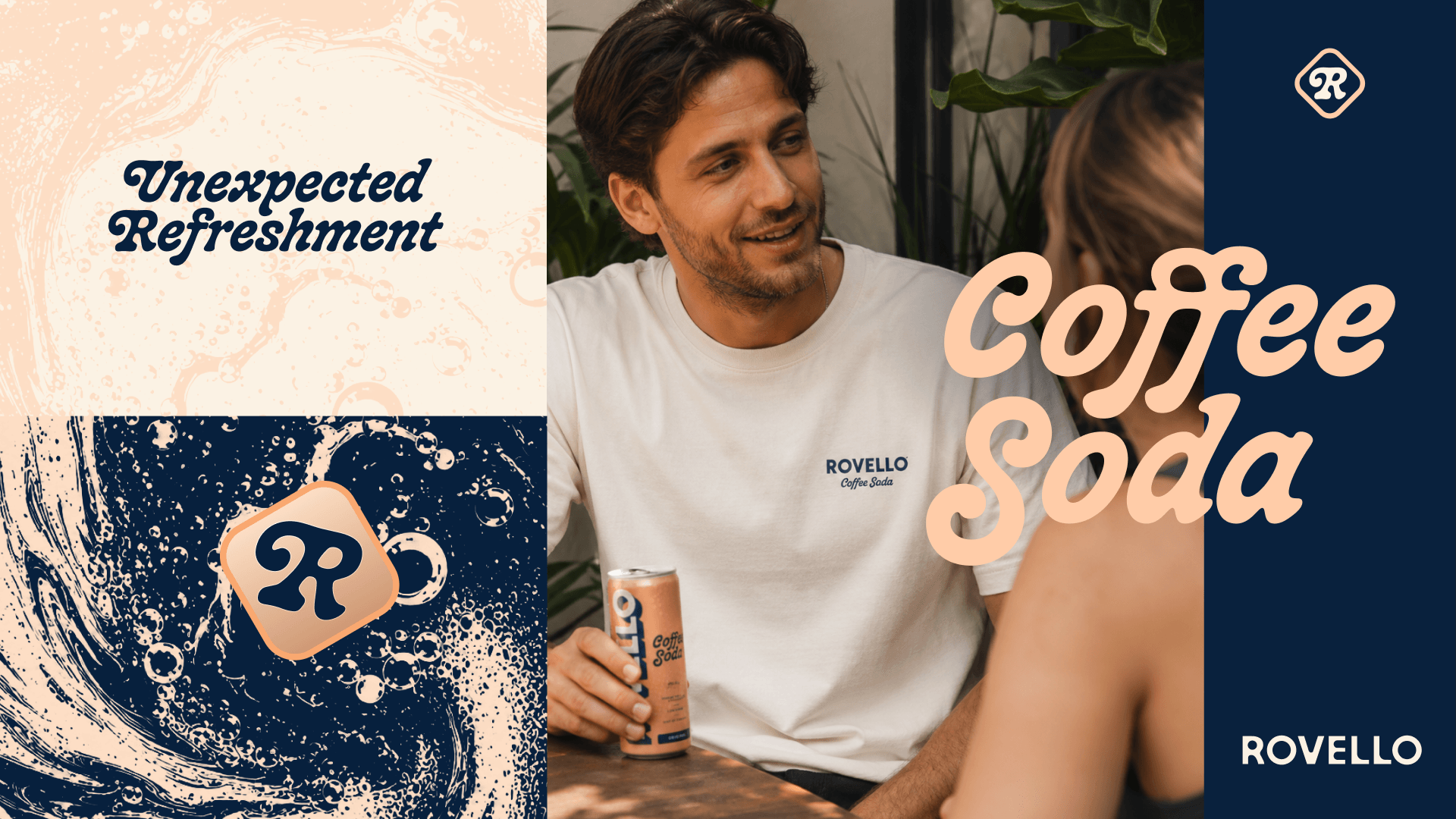
We built the strategy around a feeling, not a function. Energy drinks sell the boost: individual, performance-led, all about you. We didn't want to sound like that. We wanted Rovello to be about togetherness, and about celebrating the small moments in every day.
Coffee and soda is a contradiction, and we leant into it. Curiosity starts when something familiar shows up in an unfamiliar form. It's the gap between what you expect and what you're holding. A new drink has about three seconds to earn that second look, so we used the psychology of curiosity and discovery to build it in from the start.
Naming
The name came straight from the strategy. We explored words around travel, arrival and welcome, and landed on rove, to travel, plus hello, the greeting when you get there.
We wanted it to sound Italian too, borrowing the warmth of coffee culture without the cliché. And it had to be bigger than the can. Flavours, a club, merch and a community can all live under Rovello. Brands with descriptive names spend years trying to outgrow them. Rovello won't have to.
Identity
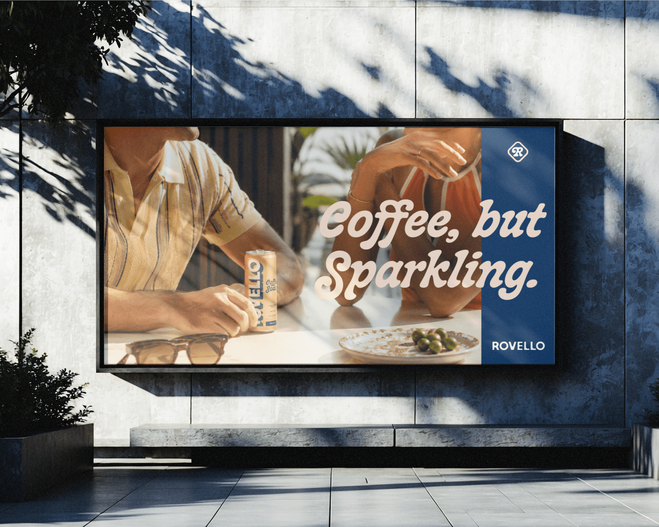
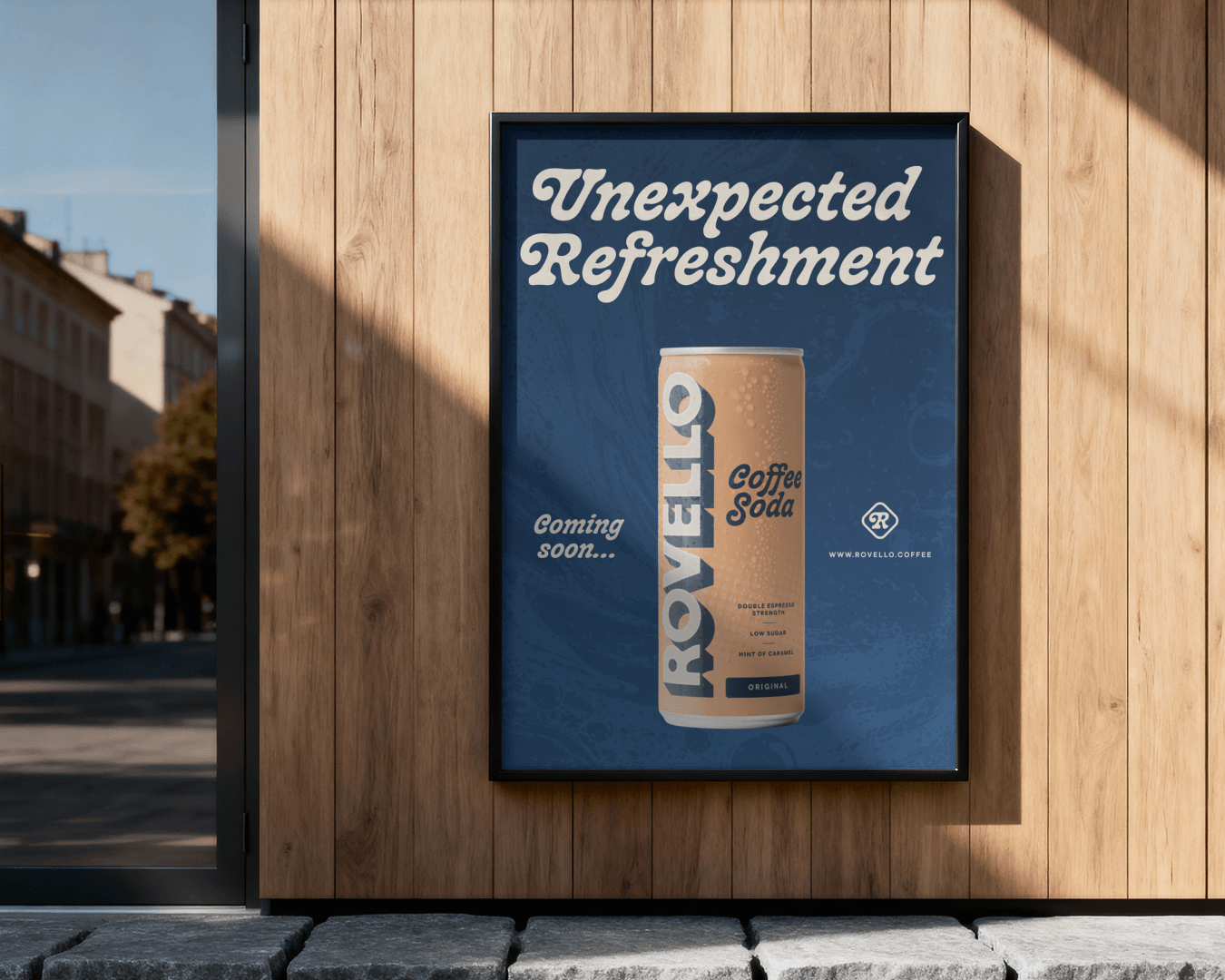
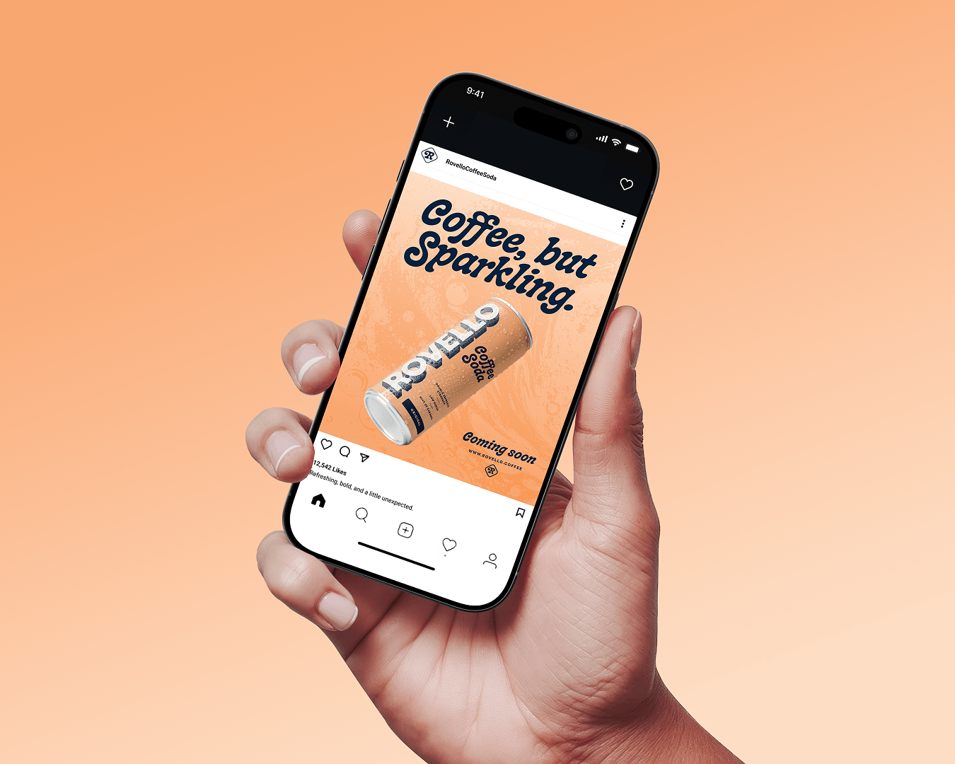
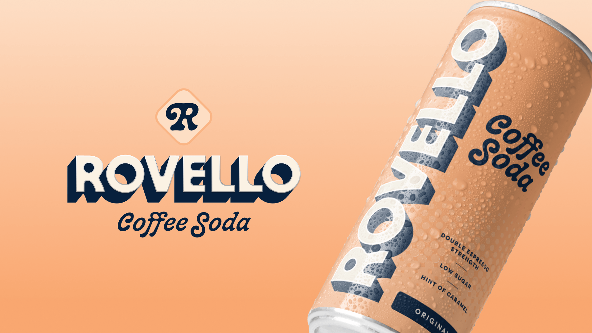
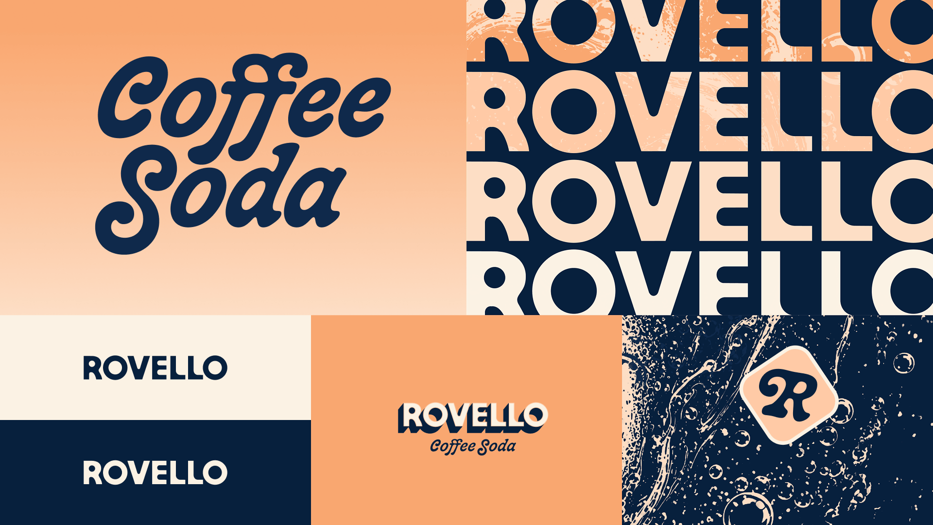
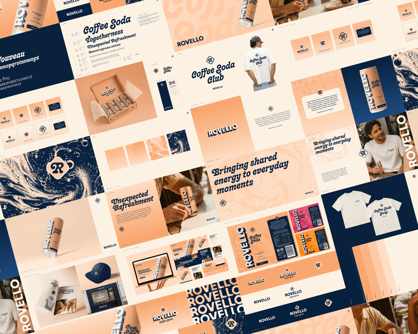
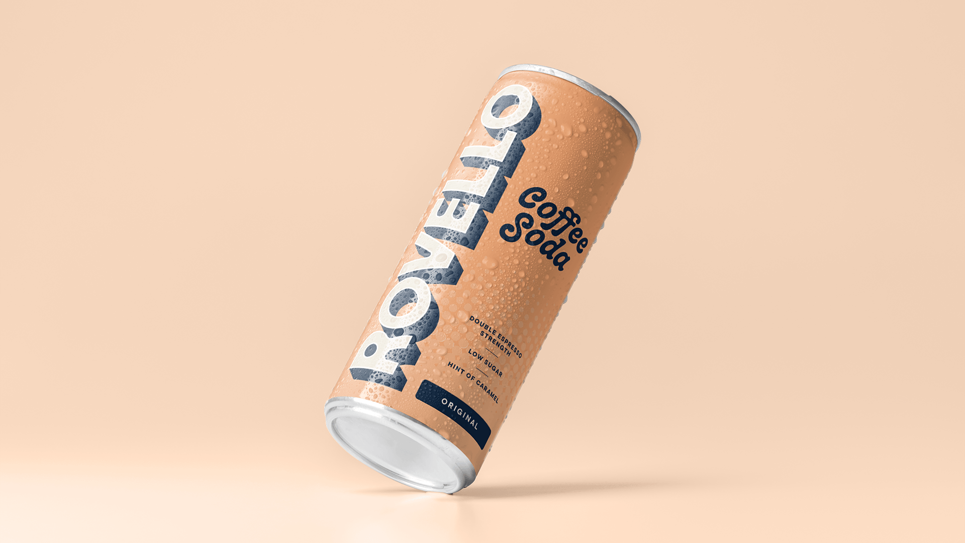
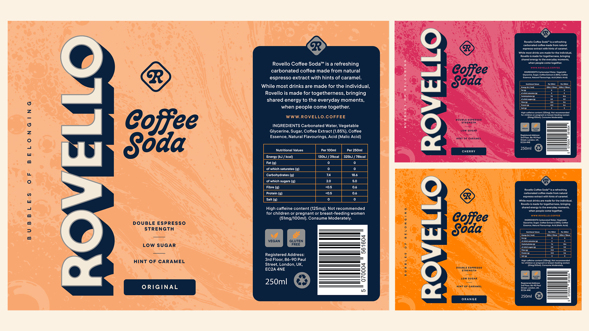
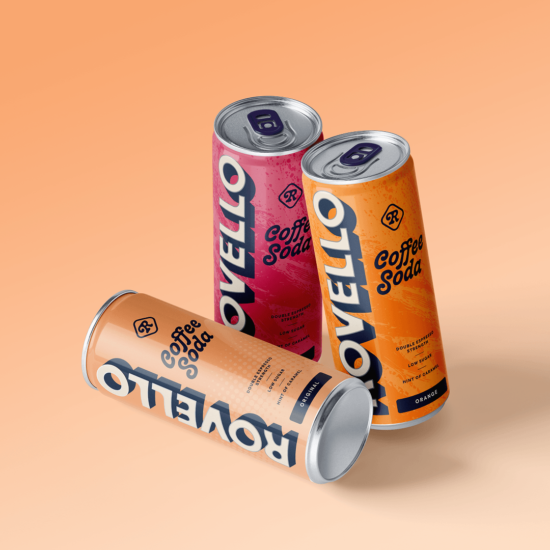
The drink is a collision of two flavours, so the identity is too. We wanted a wordmark with real presence, running down the side of the can so it's seen from across the room and still read in your hand while you drink. It sits against a looping script, deliberately mismatched: coffee's warmth against soda's fizz.
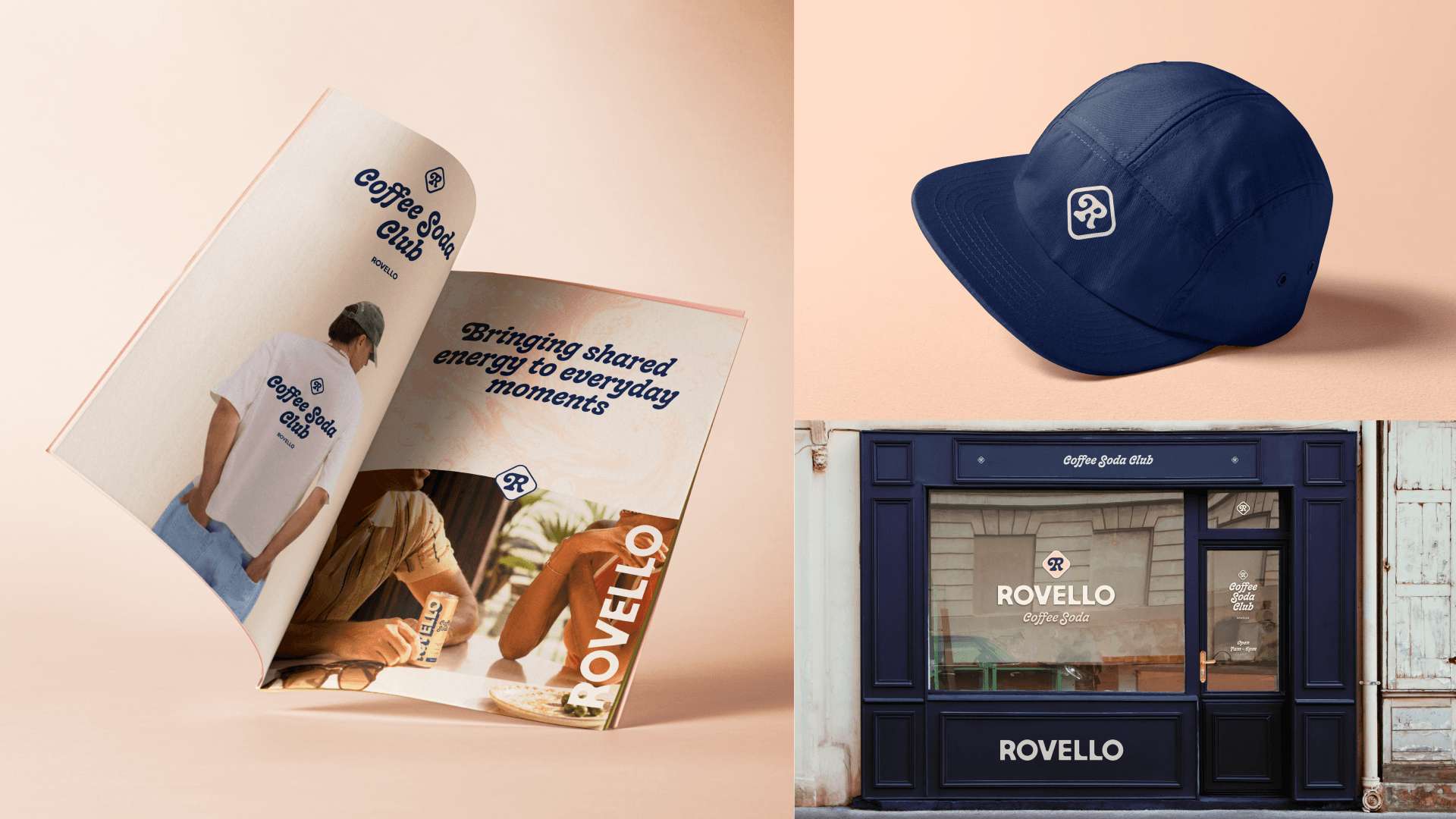
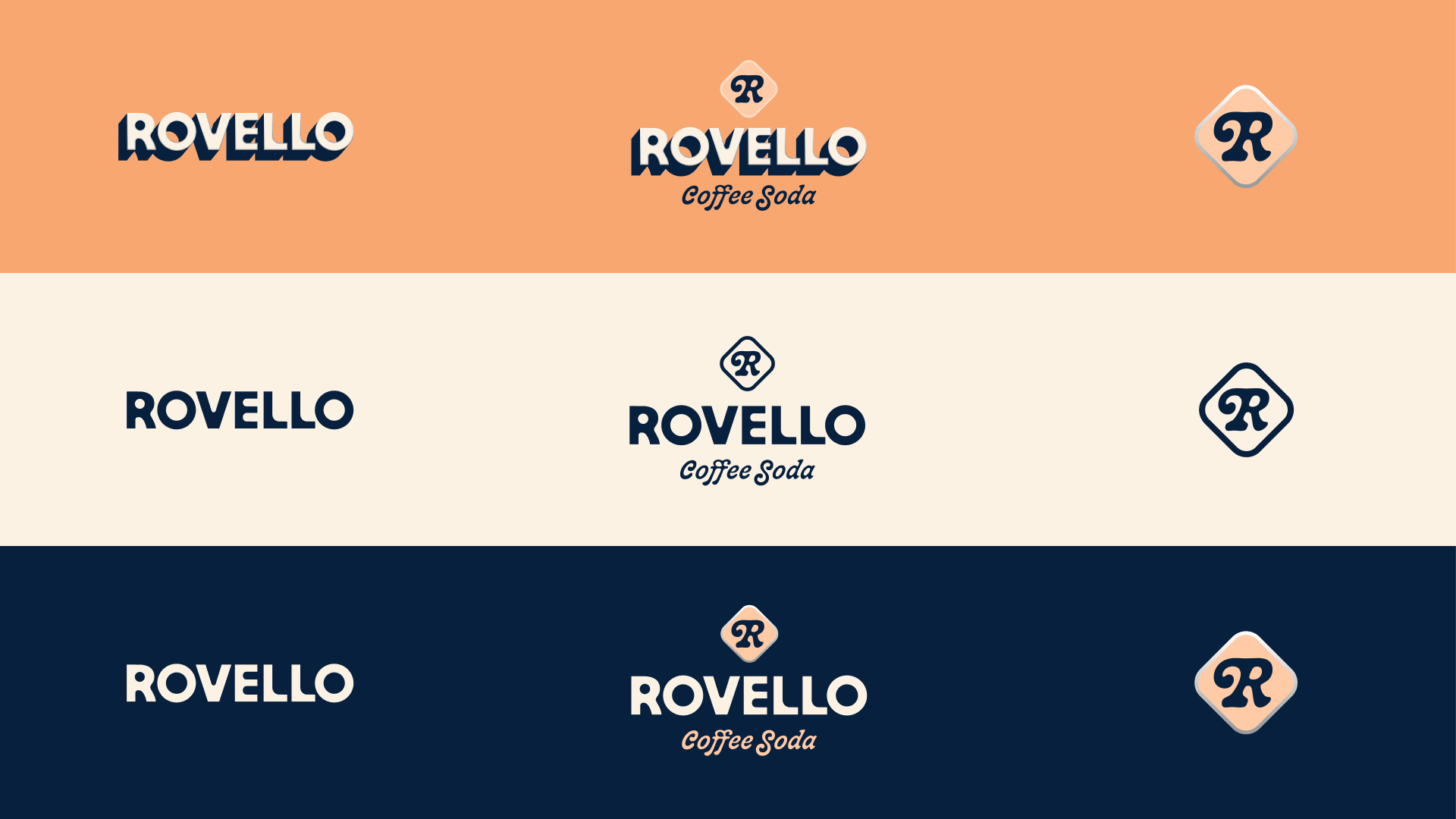
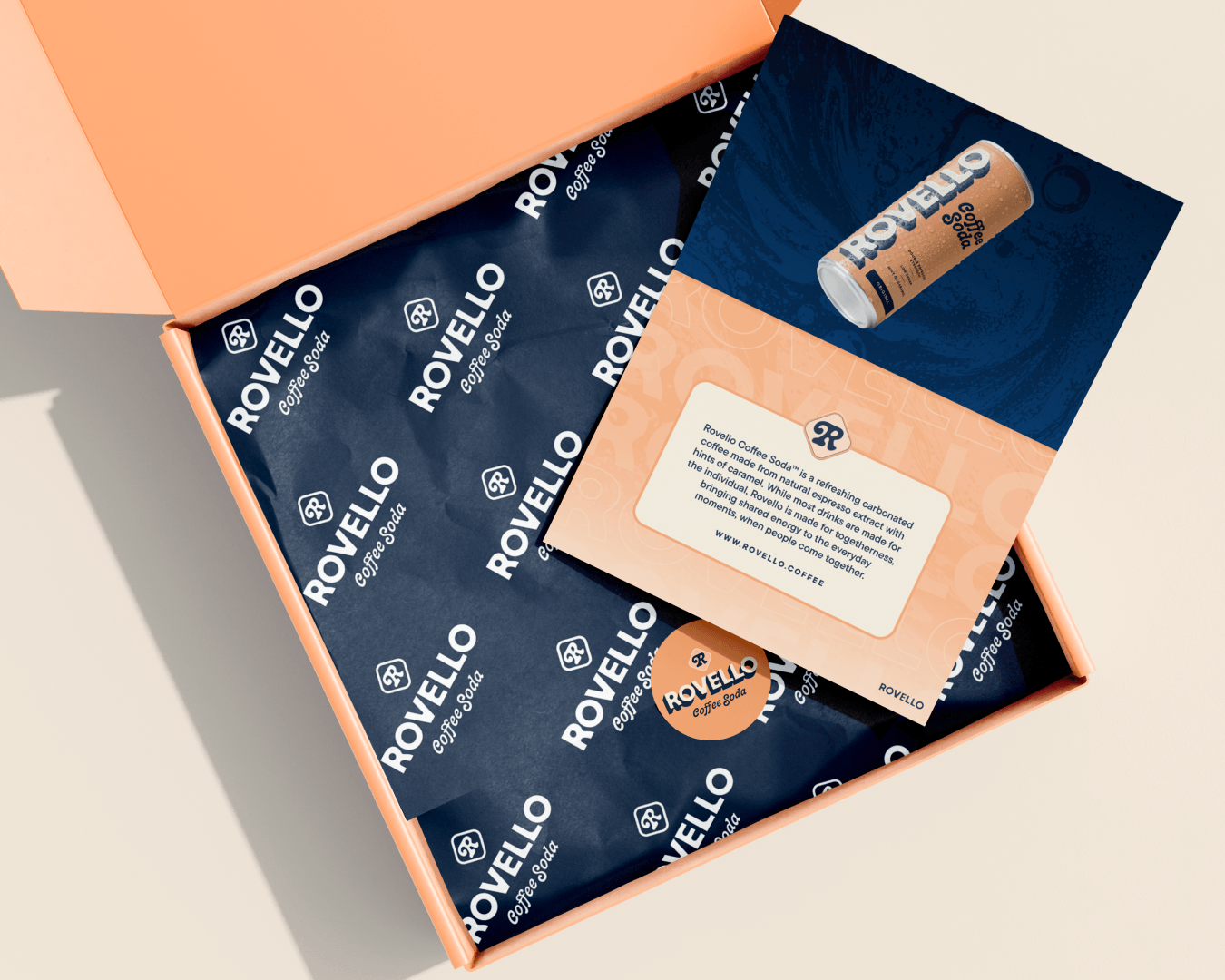
We looked at a wide range of colour options before landing on deep navy against tangerine, caramel and peach. Coffee is brown and black, and functional drinks are neon, so this gives Rovello a corner of the shelf nobody else owns. It's appetising and instantly recognisable, with room to add new flavours later without losing the brand equity. A marbled, liquid texture runs through it all, and the script R monogram is the one settled mark in the system, built to travel on small formats like stickers and social avatars.
Insights
Launching a new drinks brand taught us that category creation is a branding job before it's a product job. When there's no shelf set to borrow from, the brand has to explain the drink, earn the second look and justify the price in about three seconds. In a crowded FMCG fixture of functional drinks, energy drinks and RTD coffee, being recognisable matters more than being polished. That's why we owned a colour territory nobody else was standing in, and why the wordmark was built to be read from a distance. We also learned to lean into the strangeness. Coffee soda is a contradiction, and a contradiction is what makes people curious enough to try something new.
The second lesson is to build for what comes next. A beverage brand strategy has to scale: a name that works across new flavours, a visual identity with room for range extensions, and a community layer that gives a new brand an audience before it has distribution. We built Rovello with retailers, investors and future flavours in mind, because the strongest drinks brands are designed to be easy to stock, easy to back and easy to grow. Togetherness gave us the idea, but commercial thinking made it work.