







Brand Creation
Keeps
The Project
Keeps is a regulated sports investment platform giving retail investors direct access to an asset class historically reserved for institutions, the chance to invest in the clubs and sports they love.
Founded by Liverpool legend Sir Kenny Dalglish and backed by partners spanning sport, financial regulation and technology, the brand had to do two jobs at once: earn the trust a regulated financial product demands, and still feel like it belongs to fans, not institutions.
Roles
Nomenclature, Brand Strategy, Product Strategy & Development, Visual Identity, Messaging, Digital Delivery, Creative Campaigns
Brief
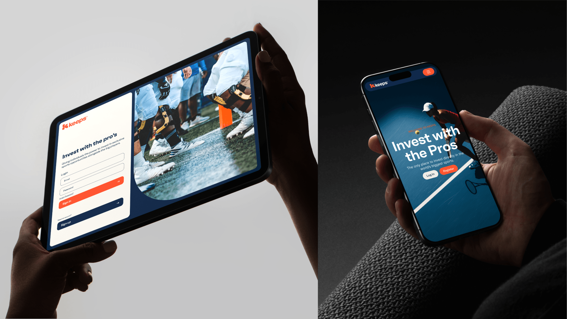
Velvet Badger came onto Keeps at the earliest stage, as long-term strategic partners. The brief was to define the Keeps product and brand from the ground up and build an identity and design system able to evolve alongside the product.
We worked as an embedded partner, ensuring brand and product evolved together as one system. Every decision, from naming to messaging to individual product calls, was made against the same view of the business: category definition, investor trust and consumer insights.
Identity
The name 'Keeps' was born out of a desire to own the emotional and financial future of fandom. It evokes a sense of holding onto something valuable, enriching the user's connection to their favourite sports, teams and athletes. The name also resonates with the idea of holding true to one's beliefs and passions, mirroring the dedication and loyalty sports fans have towards their clubs and idols.
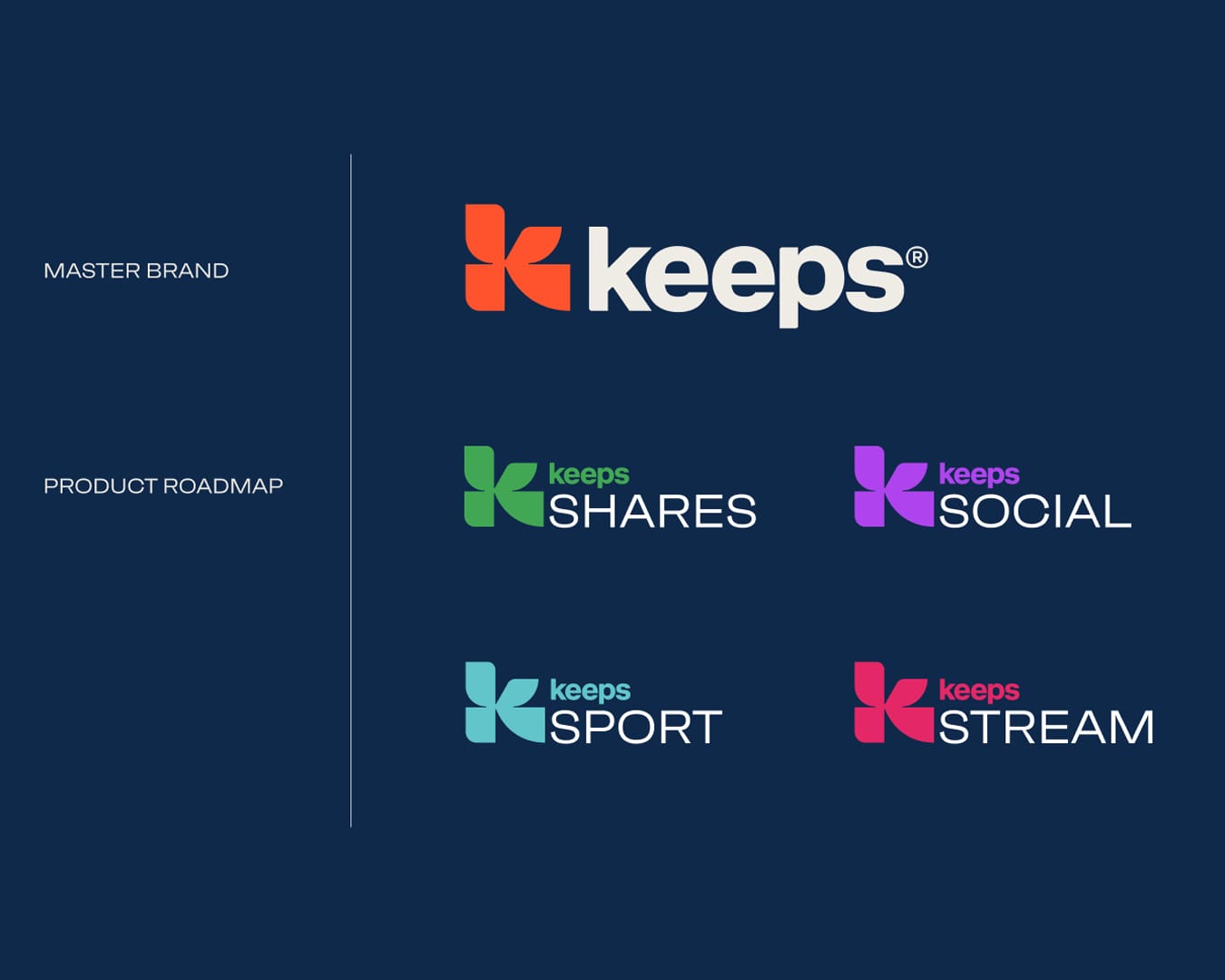
The Keeps symbol is a bold, geometric “K” built from the four distinct forms each representing one of the brand’s products: Shares, Streaming, Social and Sport. It’s designed to feel dynamic and balanced, like sport in motion. The curves and cuts give it energy, while the symmetry adds structure.
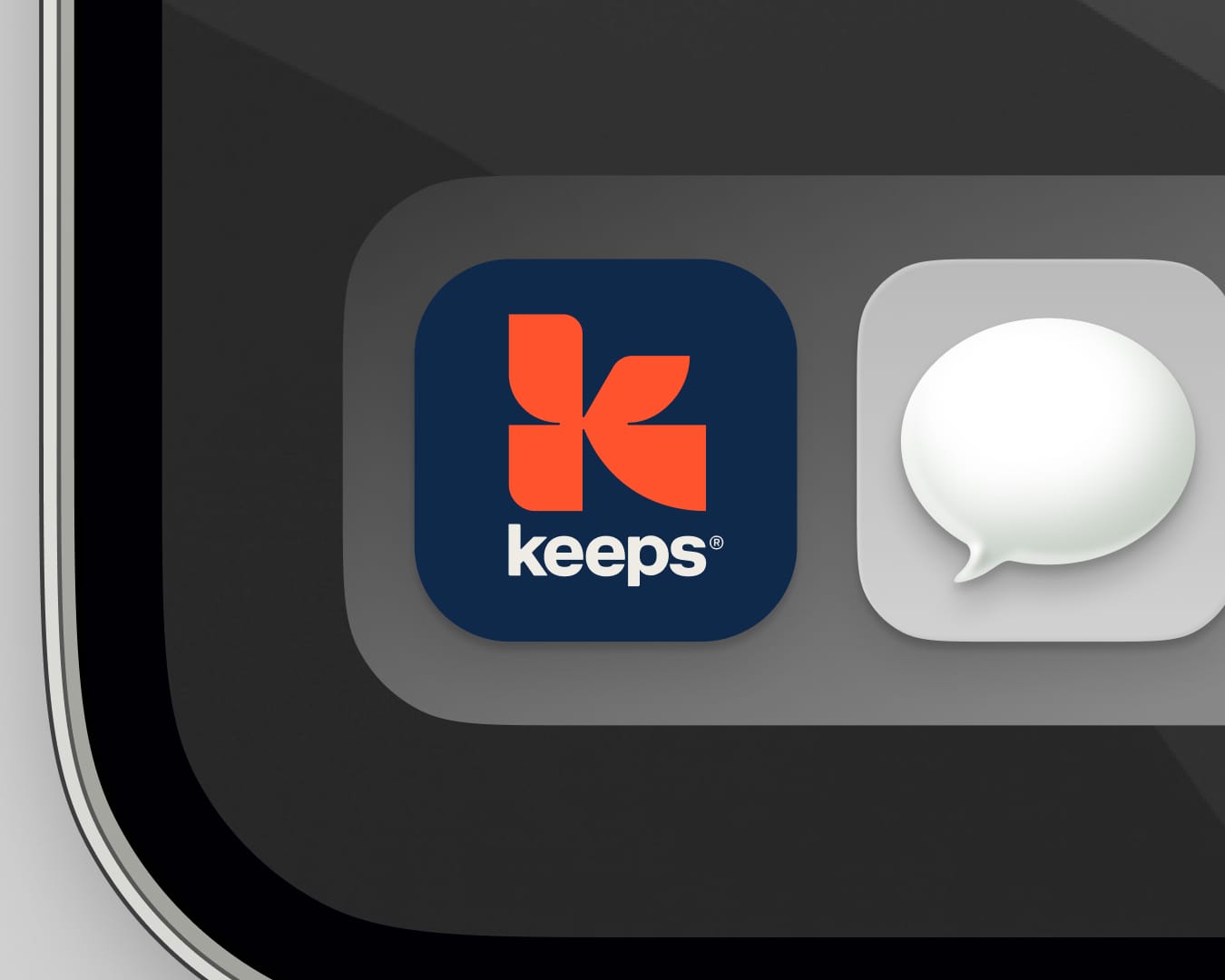
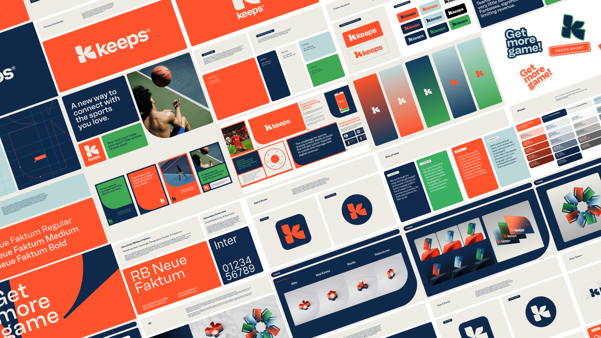
The Keeps identity was designed with energy and motion built in but taking it into three dimensions added a better quality feeling to the brand. How fast the K moves, how it holds weight and light as it turns, how a typeface built for flat campaign headlines behaves once it's spinning in space. Every 3D asset had to move the way the brand reads, purposeful and a little aggressive, never soft, never generic.
Brand
Expression
The real challenge is turning an idea into something that breathes through design, speaks through copy, moves through content, and lives across every experience. That was the journey with Keeps.
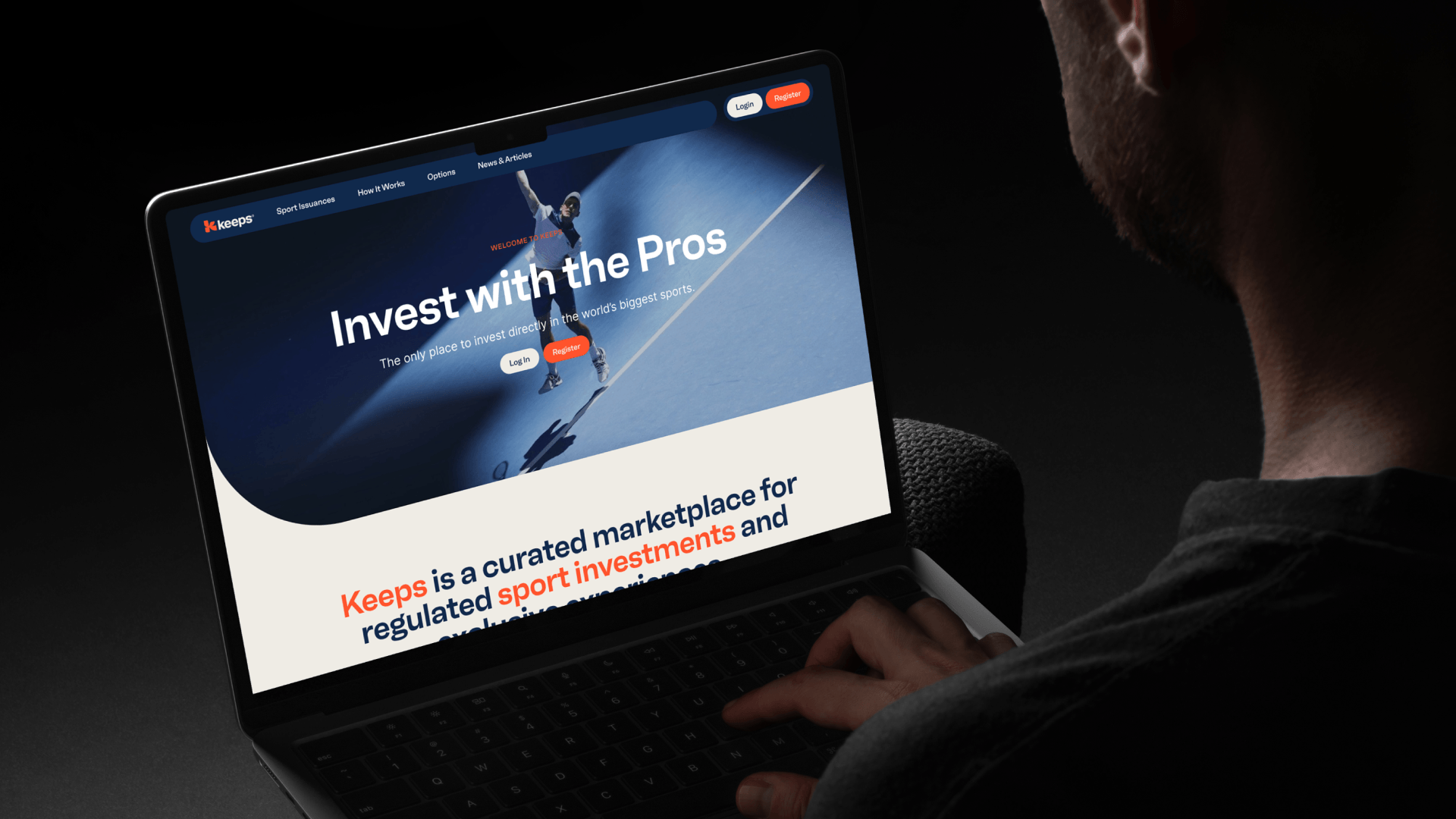
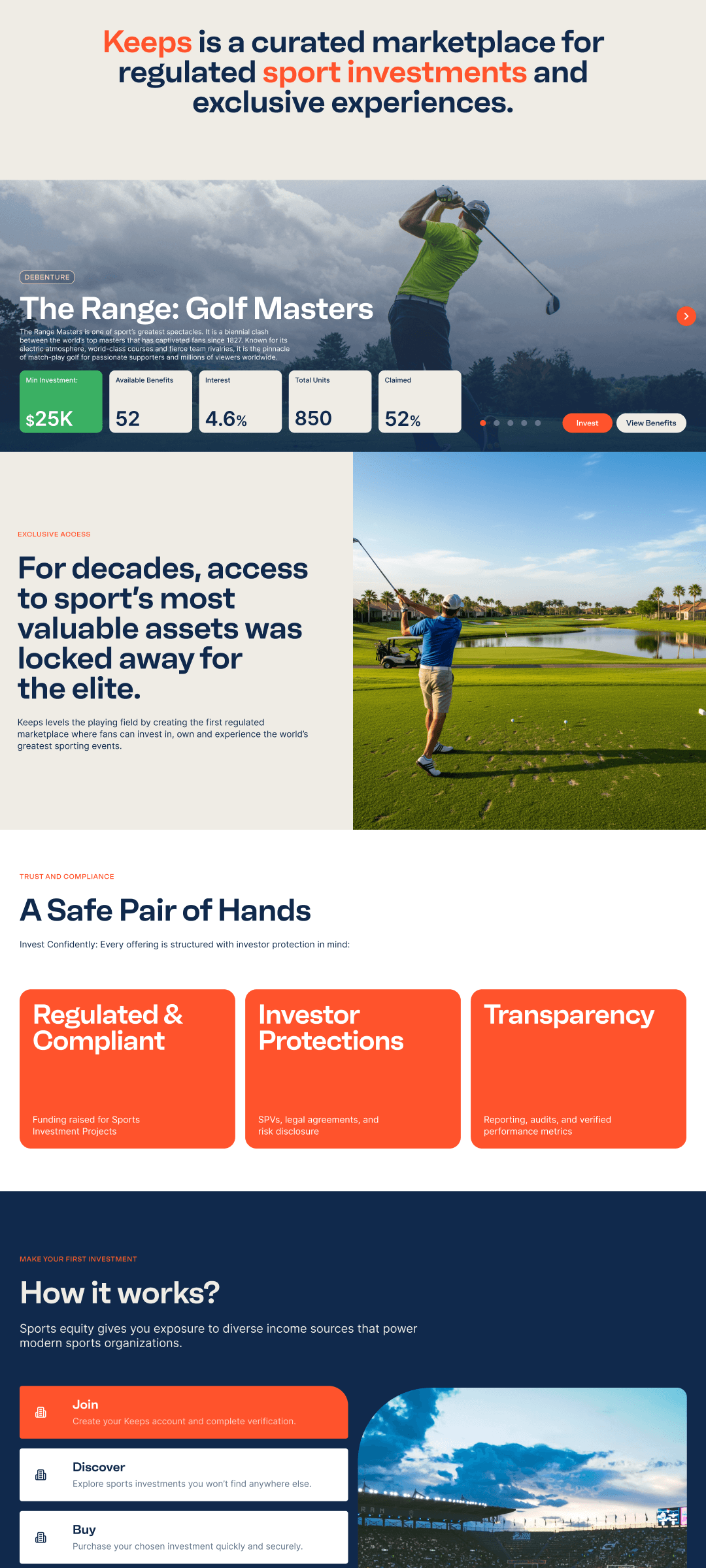
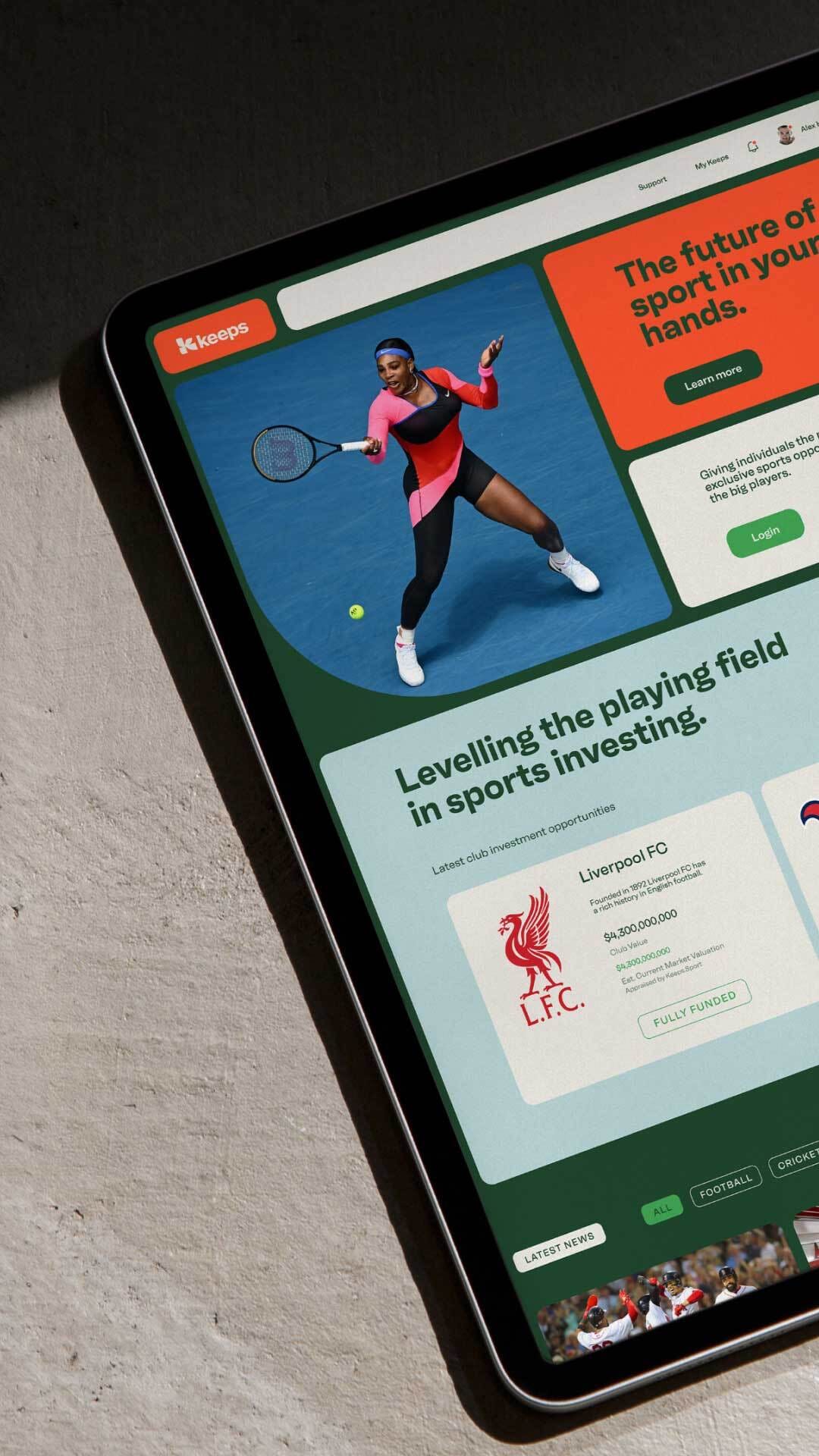
We built a flexible brand system rooted in motion, energy and layered meaning. The typeface is purposeful, bold and full of character. It adapts across formats, from campaign headlines to micro-interactions within the product.
We didn't want Keeps to sound like your average fintech or fan app. So, we defined personality traits, along with a complete verbal identity and tone of voice. One that sides with the supporter.
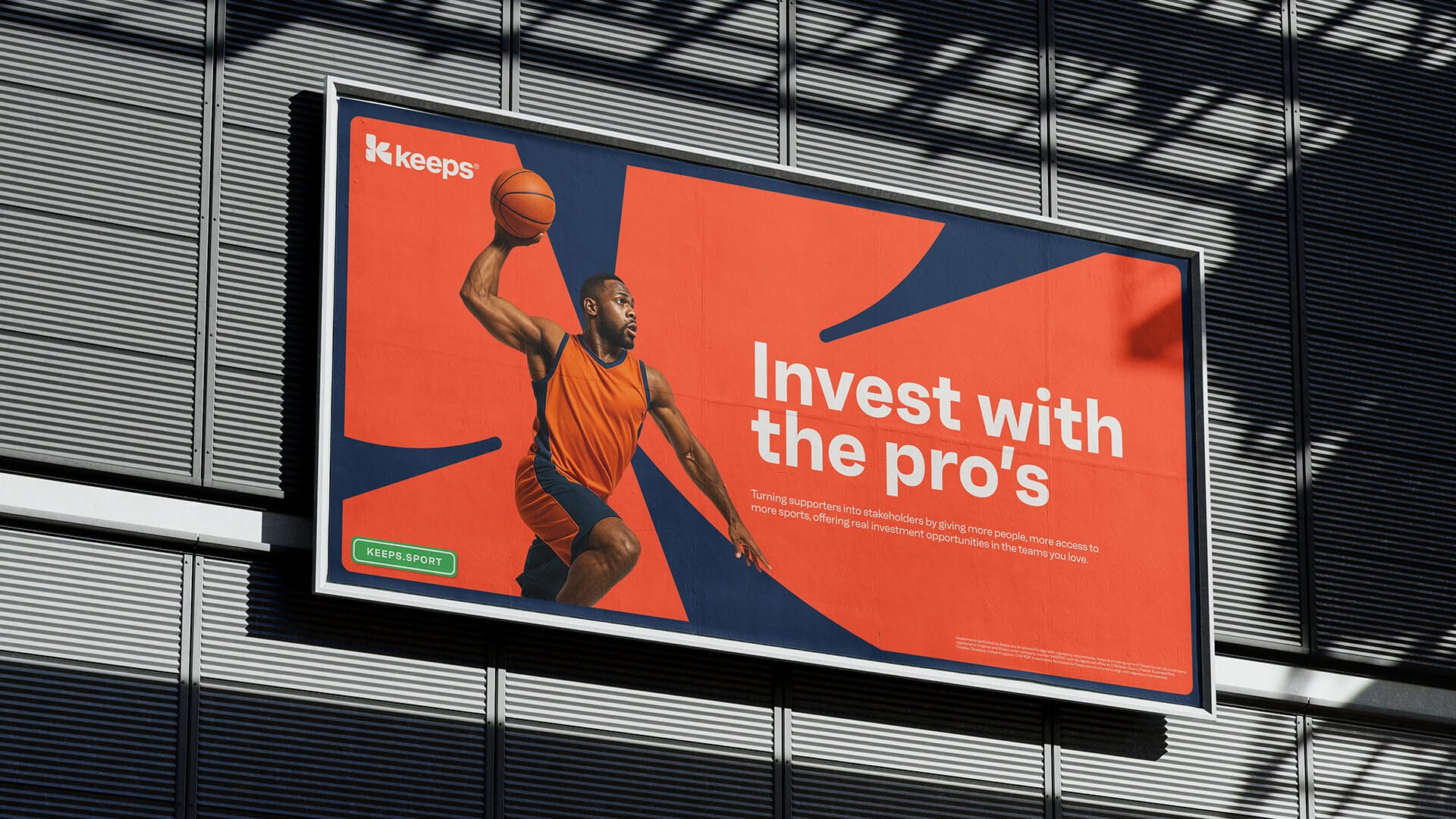
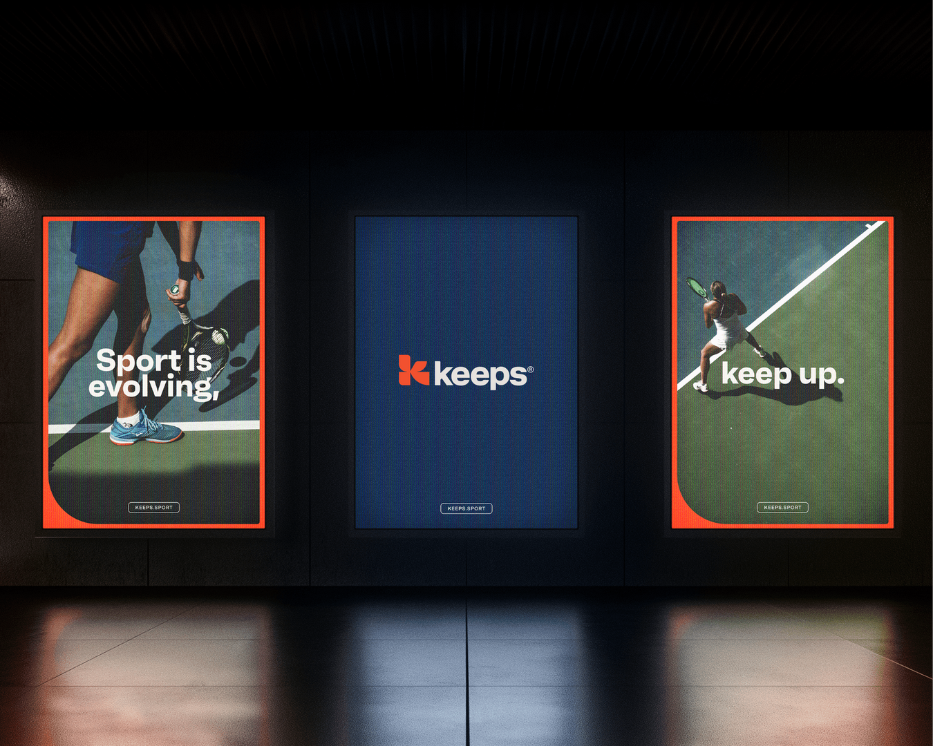
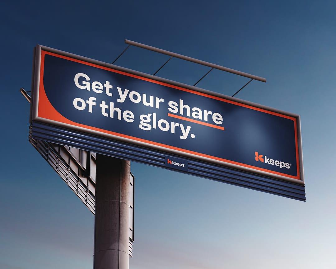
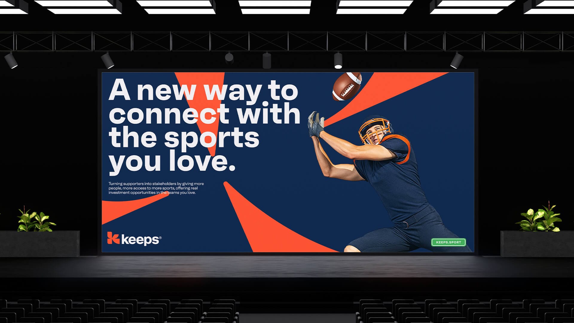
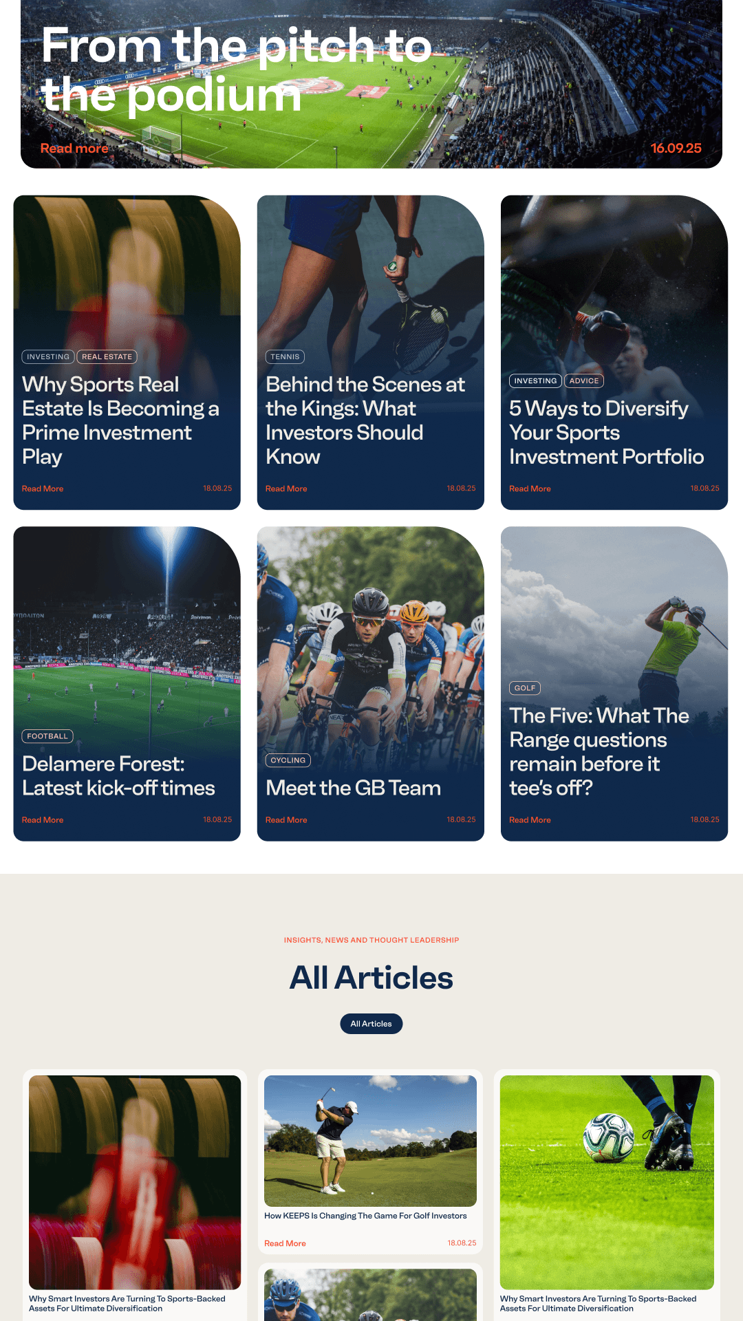
Our social and content strategy for Keeps brings together the emotional pull of sport and the financial world of fan investment; driving awareness, engagement and reinforcing the brand's bold personality. We focus on content that celebrates access, ownership, and the intersection of fandom and financial insight. Every post, reel and story is designed to educate, entertain, or empower fans. With a modular storytelling system and a distinctive tone of voice, the Keeps brand consistently stands out in a crowded category.